Ultimate Guide To Designing eCommerce Mobile Navigation
- 5 min read
A great mobile navigation is infinitely nicer than its creaky desktop predecessor. It expands and contracts as needed, keeps the important parts in view at all times, and makes it possible to accomplish a great deal with nothing more than a few finger swipes.
It’s also incredibly important in the world of eCommerce where large sums of money are on the line and sales can be lost by the most minor inconveniences. However much money an online business might save by scrimping on their mobile design, they’d soon lose a considerable amount more through all the lost custom that would result from it.
When you’re ready to start designing the mobile navigation for your website, here’s how you can go about making it as effective and satisfying as possible:
Space Things Out
Clutter is extremely distracting and makes it harder to find what you’re looking for, so a mobile site that’s too busy will send visitors away in droves. To avoid this, use a good amount of spacing between the meaningful page elements— add padding to containers and split pages into sections, differentiating them with bold contrasting colours.
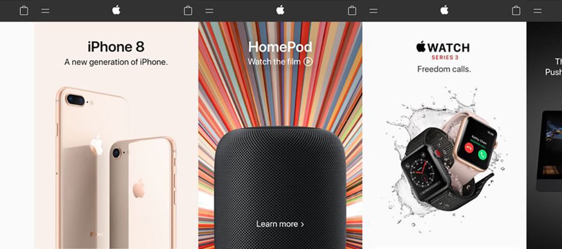
Above, you can see how Apple does this very well. No matter which colours it brings into play, it gives everything space and uses shadows and sensible shot composition to keep things distinct.
The most common (and simplest) choice for background space tends to be white, but this isn’t always the case, as we’ve just seen; black or a muted colour might be easier on the eye. It very much depends on the overall site aesthetic, and the color scheme of the brand.
Use Clear Icons
Since it isn’t very pleasant to read tiny text, and we process visual information far more rapidly than we do written information, iconography is extremely important on a mobile interface. A user should be able to recognise each icon you use, and tell at a glance where they need to go in your mobile navigation to reach whatever function or resource they’re seeking.
Universal icons (credit here).
You can use stock icons, or design your own— but if you take the latter route, you need to put time into polishing them to make sure they’re as clear as their stock equivalents. You will also need to test at length, as there can be subtle overlaps between icons that can cause ambiguity.
Keep the Menu Accessible
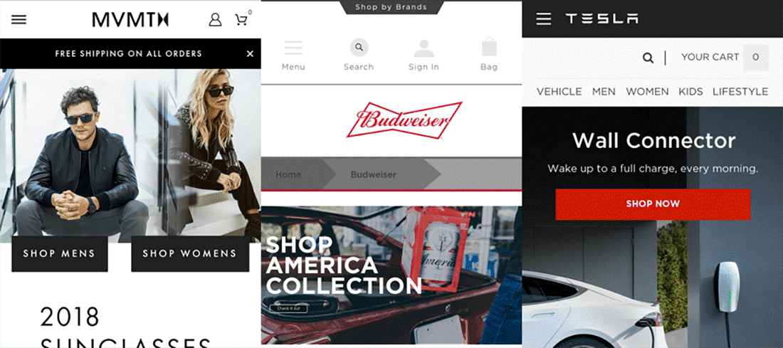
A huge part of menu accessibility is its visibility— it needs to be both clearly delineated from other elements and quickly recognisable as a menu. These days, most mobile websites favor the three-lined ‘hamburger’ icon, and it has become the standard across numerous websites such as Shopify’s template-ready store maker (as used for the example below).
Three stores using the hamburger icon.
If a user gets halfway down the page and decides they want to visit another page but can’t see how to achieve it without scrolling all the way back to the top, they won’t be very happy. As such, it’s important to make it so they can always access the menu easily.
This is usually accomplished through having the menu fixed at the top of the screen regardless of the view, or making it accessible via a sideways swipe. You can also add an arrow pointing up that will rapidly take the user back to the top of the screen.
Focus on Functionality
The average session duration for a page will invariably be significantly lower for mobile devices than desktops or laptops; people like to get their phones out, check a few things, browse briefly, possibly take specific action, then put them away (if only for a few minutes). They’re on trains, or in town, or at bars, or lounging half-asleep on couches.
That means you can’t afford to waffle. It’s very unlikely that anyone will visit your site and stick around to unpack a page of lengthy paragraphs. So you need to get to the action. What will your average visitor want to do? Buy something? Get a consultation? Upload a file? Find a specific piece of information? Whatever it is, whatever your main value proposition may be, you should place it front and centre on the homepage so they can’t miss it.
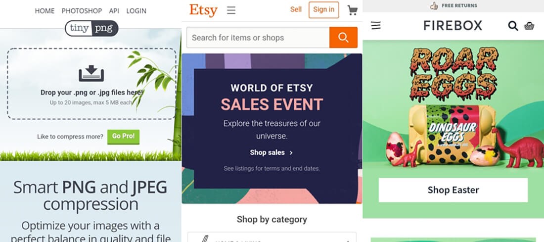
Three sites I’ve recently visited (see the hamburger icon again).
Here are three sites I like a lot, with varying degrees of complexity. TinyPNG does image compression, so it goes right to the drag-and-drop functionality— no need to read a blurb first. Etsy has a simple search bar, a simple sales notice, and a simple category selection, all visible above the fold on my phone. Easy. And Firebox has a terrific hero image and a link to their Easter goods, which is sensibly timely.
But don’t think that this functional approach stops at the homepage. Your navigation should smoothly take the customer all the way from arriving at the page to taking the required action, no matter how lengthy that action is. Think about how many sales are lost because of poor checkout form designs.
Use All Available Resources
A simple way of recapping what we’ve looked at so far is to say this: make things easy. Make every part of the user’s journey as simple, fast and pain-free as possible. People are always inclined to take the path of least resistance after all. In that vein, you’ll want to make good use of all available resources to help you build your mobile navigation.
There’s no sense in putting more work into the process than you need to. Focus on all the elements unique to your situation. Follow top web design industry newsletters for tips and tricks, keep an eye out for new software and web tools that might prove useful, and take advice wherever you can get it.
Designing an awesome mobile navigation does take work, but by obeying these basic principles, you can make the process a lot easier and offer your mobile visitors a superlative level of usability and convenience.