The Process of a Portfolio Realign
- 7 min read
Why You Should Realign
Sometimes you create an absolutely fantastic portfolio site. A month or two later you hate it. Instead of jumping on the bandwagon of designing an entirely new site from scratch let’s take a look at how you can do a portfolio realign on your current site and improve what you’ve already got. This process has a number of benefits, the main one being you don’t have to start from the very beginning. Instead, you can iterate and improve upon what you already have.
Research is the key when to comes to the design of websites and apps. You get nowhere without thorough research and anyone who’s been designing web products for more than a couple of years will tell you the same.
Your portfolio is a product just like anything else. Instead of letting potential clients make up their minds on whether or not to hire you, you need to guide them into making that decision.
In the end you’re left with a product that sells itself much better than it did before. However, it’s basically the same design so what do we change? I recently did this on my own portfolio site and learned a lot along the way. Read on to find out what I changed, but more importantly why I changed things in the first place.
You might also like: 5 Tips To Enhance Your Portfolio
Social Proof
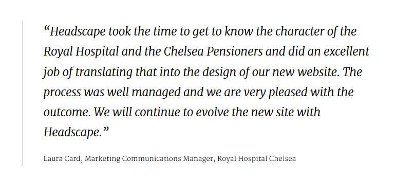
I can’t stress this enough. Unless you’re living off referrals and have so many new leads coming in you need to turn most of them down then social proof is a must-have. You might be wondering what social proof is. It can be a few things depending on your product, but in the case of a portfolio it’s the use of testimonials.

You may have seen reviews on Amazon about a product you wanted to buy. What is the likelihood you’ll buy if it has a bunch of 1-star reviews? If people see other happy customers they’ll be more inclined to trust and in-turn become a customer themselves.
You can even go one step further by stating that they’re ‘Client Testimonials’ instead of just ‘Testimonials’. It’s a small change, but it’s usually the little details that help people convert. The take-away is that by not having any social proof on your site potential clients aren’t being pushed in a direction of trust. By incorporating it people feel more secure about your abilities and services.
A Strong Call to Action
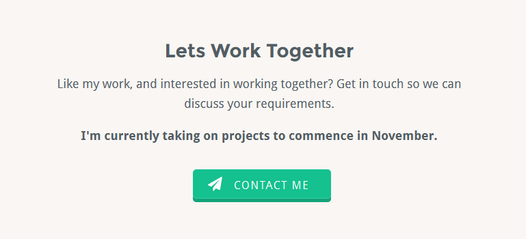
I did have CTA’s on the previous version, but they were weak. This time I went for big and bold with a little scarcity to attract attention. I’m still not 100% happy with the design of the main CTA but will make it better over time.

No matter how good your call to action is people won’t follow it unless the text speaks to them. This is the tricky part and there are a couple of good options. I decided on asking a question and then following through with a short piece of text informing potential clients of my availability.
Little tip: Always seem busy, even when you’re not. This creates a feeling where your availability is limited and to work with you people need to hurry up and get in touch.
Frame Your Work Nicely
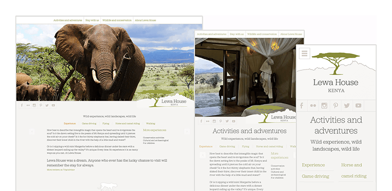
Time and time again I see lovely looking portfolio sites where very little care has been taken to crop and present each piece of work. Each item in the last version of my site was a tiny little 250px image with some text overlay. Very bad indeed. You can’t expect someone to hire you when you work doesn’t speak for itself.

I’ve still got a bit of a way to go until my portfolio items are perfectly framed. However, it’s best to stay consistent in what you present. Notice on my own ‘work’ page how each image is cropped from the top-left to around 3/4 the way across. This was intentionally done to provide anyone viewing my work with a sense of unity which will then transform into an organised feeling towards my work.
Don’t mistake little tricks like this for actual work. You need good copy (more on copy below) and well-rounded work above everything else to make someone ask for a quote or send you a message. However when you add all the little details together it provides people on your site with an experience that’s sure to give them confidence in your abilities.
You might also like: Fixing Common Freelance Mistakes
Show What You Do
I know creating a services page isn’t always fun but you need to spend time on it if you want to the right clients to hire you.
My main focus always has been (and will be for a long time) to design and develop websites. I love doing it more than anything else so it’s my main service.
Web design and UI design go hand-in-hand as most apps need some sort of marketing site but don’t get the two confused because they’re vastly different and require much different approaches to get right.
Grab a piece of paper and write down everything you can do well. You don’t have to be amazing at everything on the list, this is simply to get a base line of what you could be offering. You can narrow it down in a minute. Here’s what I came up with:
![]()
Start out by broadly defining what you do best and work you way out from there. Once you’ve got between five and ten things down you can choose the ones you do really well and what you want to do as full-time work.
As you can see above I also wrote down copywriting, social media and blogging. I do the last two for the web design community in my own time (in the form of this site) because I really enjoy it. I just wouldn’t want to do it for someone else so I decided against adding them to my available services.
I enjoy many aspects of copywriting like testing out different post titles, improving sign ups by optimising the available information, writing product infomation, but I don’t like doing it long-term so I decided against that as well.
In the end I narrowed it down to three main services. I added design, development and WordPress all under one service, UI design under one and SEO/conversion optimisation under another.
By doing this I’m narrowing down my skill-set to appear more a master of some and rather than a jack-of-nothing.
Make Contact Effortless
This part goes hand in hand with strong calls to action (above). When it comes down to it, people are lazy and always looking for the next best thing to make their lives easier. It’s the main reason why the robot vacuum and butlers exist.
Make sure you take this into account when planning how people will contact you. The best way to achieve this is by offering multiple, yet not too many, means of getting in touch.

On my contact page I started off with just a form but realised a few days later that people may not necessarily want to hire me. Other web designers could be looking to work with me on a project and that’s why I ended up putting my email address and Twitter handle just above the form so I can catch anyone who doesn’t fit the form criteria.
You might also like: Freelancing or Employment? Which To Choose
Final Thoughts
The idea of realigning your portfolio instead of redesigning it should be clear. You can build on top of what you already have instead of starting form the ground up.
Sometimes it’s worth starting from scratch if it’s an entirely new project but there are many times when building on top of what’s already there is a much more viable option when both time and money come into play.
Think about HTML/CSS frameworks like Bootstrap and Foundation. They both give you a starting ground to build from instead of having to creating the same things over and over again.
Squarespace is another great example. If your aunt needs a site for her book club it’s highly doubtful she’ll be able to afford the price tag of a full-blown website design and development. In these situations Squarespace gives people the foundation to get going without wasting time on activities that could be spent on other things that will most likely give more value.
I’d love to know what you’re doing to improve your portfolio in the comments below!
jaysen freelance web design London
February 8, 2015 at 4:24 pm
Really strong arcticle SEO is so important now for Designers in freelance industry!