How To Write SEO-Friendly Landing Pages That Convert
- 5 min read
In many ways, a great landing page is analogous to an inviting hotel lobby. It offers a polished allusion to what’s in store for the viewer if they choose to take the suggested action, and directs them accordingly if they decide to do just that. And using a landing page that’s unsuited for SEO is like owning an unlisted hotel: looking fantastic won’t matter, because no one will see it.
Since the whole point of a landing page is to drive conversions, you need both components: the ability to be found by relevant people, and the ability to turn those people into buyers. But how do you achieve this? How do you write landing pages that are SEO-friendly and powerful enough to win over the resulting visitors? Here’s how:
Build around vital keywords
Keywords aren’t what they once were (thanks to the rise of semantic search), but they remain at the heart of SEO, and that’s unlikely to ever change. If you have a landing page about (for instance) a training course for PPC campaigns, including the term “PPC campaigns” isn’t optional. Talking around the topic is just going to cause confusion and damage your rankings.
This all sounds extremely obvious, but plenty of landing pages go unoptimized because the writers assume that they don’t need to mention particular things because they’re clear from context. Why specifically mention PPC five times when the page is about PPC overall? Because keywords aren’t just for readers: they’re also for search crawlers, and search crawlers need as much help as they can get when trying to work out what pages are for.

Credit: Keyword Tool is extremely useful for this.
Semantic search means that you don’t need to obsess over cramming in keywords, so the solution is simple: use the primary keywords to make it clear what you’re talking about, then naturally move to any secondary keywords that come up. That way, you’ll end up with natural-sounding text that still works well for SEO.
Include strong imagery
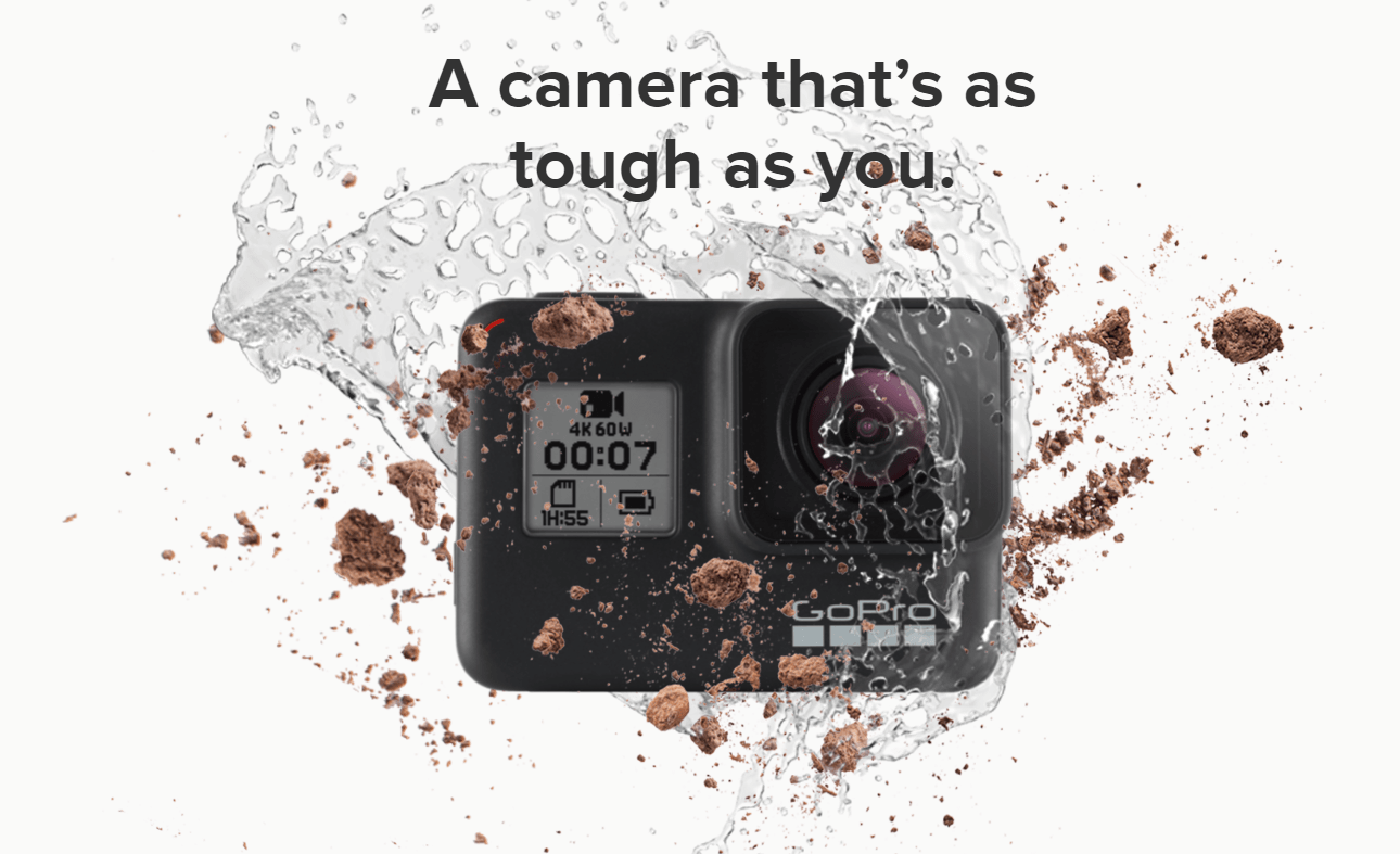
Visuals matter for landing pages. They’re arresting in a way that words can’t be, and better suited for screens of all sizes. When someone arrives at a given page, you want them to immediately get a strong idea of what they’re dealing with, including its nature and its physical characteristics — the right image can provide this invaluable context (particularly for sizing), preventing them from thinking they’ve come to the wrong place.

Credit: GoPro has the right idea with this powerful shot.
The longer a visitor sticks around on a page, the better the on-page metrics, but that’s not where the SEO value ends. A page with relevant images (relevance determined through contextual inferences and image metadata) is considered more valuable to the reader, after all, making a landing page with rich media a more viable destination.
Then of course there’s the broader potential of images to drive conversions, particularly for products. When someone can see a product, they’ll immediately be more likely to trust the offer enough to buy it, so make your landing page as glossy as possible. That said, keep in mind that not every image on the page needs to be produced internally. While prominently featured shots should be slick and product-specific, you can still work in free to use images with blurred overlays for background shots, or use them to illustrate specific benefits.
Deliver responsive layouts
Mobile-friendliness is great but doesn’t fully communicate the ideal format for modern-day digital content. Mobile-first is a more suitable description, but that’s more about the method than anything else. The ultimate goal is to provide responsive layouts that work no matter how they’re expanded, contracted, or warped.
Any page that doesn’t render well on mobile is already at risk of being punished in mobile search rankings, so it’s likely that Google will get stricter in the coming years when it comes to standards. When creating a landing page, then, think about its simplest and smallest form: on an average smartphone, how will it work? Where will the copy go? How will the CTA function?
Since you’re likely to be working within an established CMS (probably an ecommerce variety for landing page conversions), be sure that you’re using a suitable foundation, because it will be down to the CMS developer to keep adaptive templates updated. Popular choices such as BigCommerce and Shopify place a lot of emphasis on high-quality templates, so anything along those lines should do the trick.
Embrace minimalist design
Design minimalism has become increasingly popular in recent years, with the huge growth in mobile traffic being a major contributing factor. Smartphones aren’t as powerful as desktops or laptops, they have smaller screens, and they have data connections that aren’t as consistent — this all adds up to a need for better performance and use of space.
You can make a content-dense page fully adaptive, but it will run up against major issues at smaller screen sizes. Think about buttons, for instance: you can click a small button without much difficulty when using a mouse, but when you’re operating a capacitive screen using your finger, you have different size requirements.

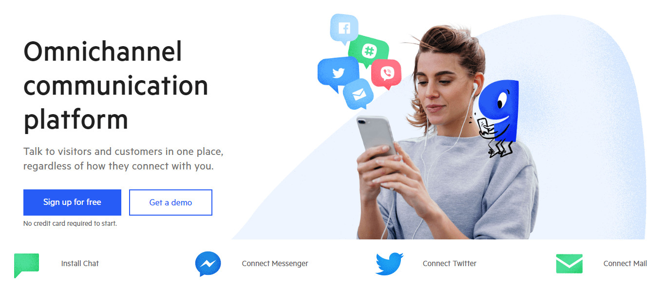
See how Paldesk gives every element clear presence.
Minimalist design is all about stripping the unnecessary elements from a page and leaving in only the essentials (this is already widely used for email optimization, but people have been slower to adopt it for their websites). You can freely draft a page, but when it’s content-complete, subject it to a thorough review to determine which parts can be taken out. The less content you have, the more focus will be placed on what’s actually there, and the stronger the contrast between content and negative space will be.
Landing pages are often simple, but that doesn’t make them easy. It takes a lot of work to optimize a landing page to bring in a steady stream of visitors and convert them into customers. The good news is that the process isn’t that complicated: follow these tips, stay apprised of SEO updates, and you’ll get the results you’re looking for.