10 User Experience Tips for Better Websites
- 9 min read
When it comes to UX design there are seemingly an infinite amount of things we can do better to improve our websites. However, not everything has the same impact and some things work better in certain situations. The keys to any successful projects user experience is a lot patience and even more testing.
Below I’d like to share 10 user experience tips you can use to give your users an easier, happier time using your website.
If you’ve got any suggestions you’d like share please don’t hesitate to leave a comment below and I’ll be sure to include it in the list.
You might also like: 15 Ways to Improve an eCommerce Store (1 of 2)
1.) Explore Your Options with Sketching
Before you head into Photoshop, Sketch or your design tool of choice, draw multiple variations of what you’re trying to create. The biggest benefit of this is you’ll be able to quickly create mockups that convey the layout with very little time invested.
Sometimes the first sketch will look perfect and you’ll struggle to find a problem with it. This is the perfect time to experiment because you’ll really be pushing what you can do visually as you already feel you’ve done your best. Some of the time you’ll end up with sketches that aren’t as good as your original idea, but you’ll also get a few that are even better.
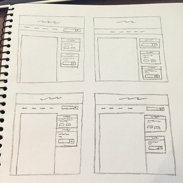
As you’ll see from the image above I explored four different options. Each one has a slight variation either on the menu or the sidebar. By doing this I was able to narrow down my choice to option four, even though I thought my first sketch was good enough to start designing from.
2.) Create User Stories And Personas
User stories and personas a quite similar but have a few defining differences. Each of which can be incredibly helpful when designing a website. When using either one try to remember that they’re different tools for different situations. Here is what they are and when to use them:
- User stories: Stories are a chain of events that lead a user to a predetermined page from a set starting point. For example: From start to finish of a checkout process.
- User personas: Personas are a set of predefined “rules” that influence how a certain type of user would use your website. For example: On a banking website the average person would be looking for a personal account whereas a business owner would be looking for a business account.
There are problems with using both techniques, the biggest being that they in no way take the place of real people using you website.
For more information on user stories and personas I highly advise taking a look at this presentation on SlideShare.
3.) Look at Metrics and Data
A lot of designers who make the gradual transition to UX design don’t realise how much research becomes involved in the design process.
You need to look at what’s really happening your website, this type of data usually includes things like:
- How many people are clicking your main CTA?
- What are the most popular parts of your website?
- What are the most used features of your website?
- What are the most common bounce/exit pages?
Those metrics above should be of the utmost importance. You should always have information like the above to hand before you even begin thinking about layout and design.
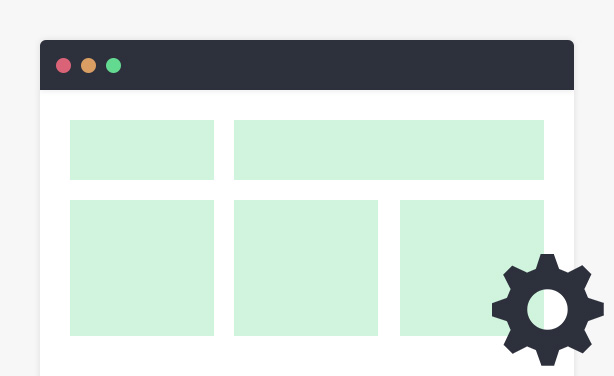
4.) Use Obvious Icons and Imagery
This may seem like an obvious point on the surface and for the most part it’s not too difficult. For example “Why would you use a house icon to represent the settings?”. By digging a little deeper it becomes apparent that a lot of websites use different icons for the same things and you need to design with that in mind.
Let’s take a look at two different examples, WordPress and Pocket.
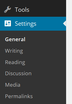

Both options are perfectly acceptable, WordPress because it actually uses the word “Settings” and Pocket because it makes use of the “gear” icon. It goes to show that even popular websites, apps and CMSs can differ in how they approach certain areas that most people will use at some point.
Some icon sets even have multiple variants of the same icon, so it pays to do some research. When it comes down to it don’t try to reinvent the wheel. I know it’s an overused saying but as any experienced UX designer will tell you, doing what people are a familiar with is always better than making them learn something new.
5.) Optimise Your Images
The first part of image optimisation comes in the form of ALT tags. Optimising your images is incredibly important for both search engines and users. There has been a lot of debate over whether or not adding ALT tags to images actually helps the user experience. Here are two places they really help:
- They let people using screen readers know what the image is showing.
- They have the same sort of effect for those on slow connections where images may take a while to load.
The second part of image optimisation is the downloadable size of the image. I recorded a quick-tip screencast a few months ago showing how to optimise images in Photoshop so they load quicker on the web. By shortening amount of time it takes for images on your site to load you’re giving users a quicker and seemingly more reliable experience.
You might also like: 5 Great Ways to Increase Form Conversions
6.) Accept That Users Make Mistakes
People sometimes click the wrong button for a variety of reasons. One such reason could simply be someone nudging them.
Another reason that seems to be becoming more active across apps and websites is letting the page load then adding something into the page with JavaScript. The big problem here is that, depending on where you load the element, it can push the page down. If someone is filling out a form it can make them click the wrong part, like the clear button when they were trying to click a text field.
Always keep in mind that people will inevitably click the wrong button or link and end up causing something unexpected to happen. Take Gmail as an excellent example of forgiving users for their mistakes. They let you delete or move email but when you do they give you the option to undo that action. By doing this they save people a lot of hassle and stress from doing something they didn’t intend to do.
7.) Adjust Your Typography
If you’re running a blog then how you go about the typography on your site is huge. Most people underestimate the effect good typography can have on their content.
As we should all know by now, content is king. It’s a saying that’s been around for many years now but is even more true today than when it was first popularised. So far on this very site I’ve put in hundreds of adjustments for font sizing, font families, boldness, emphasis, color and a load more.
Good typography is the foundation of giving a decent reading experience. Without a good foundation it will put people off and they’ll likely look elsewhere. Sure, there are quite a few blogs that are popular with bad designs. However if they tweaked the type on their sites it would give a much better and more desirable experience for their readers.
8.) Spend Time on User Onboarding
If you’ve never heard of user onboarding it’s simply the process a users goes through when using a website or app for the first time. More specifically it’s the initial information you give people.
Take an iPhone app for example. When you open them for the first time you usually get information about the app, something like “Here’s the menu” and “Tap here to see your profile”. However user onboarding isn’t just for apps, it can be extremely useful for websites as well.
I highly recommend having a look at some of the case studies on User Onboarding, which go over everything from initially landing to signing up and using services from sites like Kickstarter, Inbox by Gmail and Basecamp.
9.) Use A/B Tests Regularly
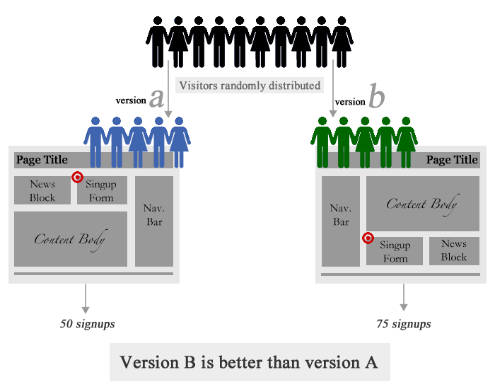
The basic idea of A/B testing is that you create two different designs, for example the first design could have a CTA with a red button and the second design a green button. You then show different users different designs to see which one is more affective, the red button or the green one.
This is a tremendously useful tool for any UX designer when the goal is, and always should be, a better experience for the end-user.
Back in 2010 Smashing Magazine published an article all about A/B testing. I highly recommend reading it as there is some great information like what A/B testing is, how to create your own tests and the do’s/don’ts of testing.
10.) Create Goals and Milestones
Without a clear set of goals to aim for, improving the UX of anything is going to be a difficult, near impossible task.
Just the other day I added a new feature to this site. That feature is a small piece of text that says how long it takes to read each post. I’m constantly looking for ways to improve what I offer here on IP and after some research I discovered it can actually make people feel more comfortable sitting down to read if they have a rough estimate of how long it’ll take.
My goals for this site are constantly evolving but sometimes you’ll have need something different from a goal, in those cases you need a milestone.
A milestone is a point where a set of tasks and goals need to be completed. Here are some good examples of milestones for UX in web design:
- Have new user onboarding set up.
- This could incorporate sub-tasks like write copy for onboarding steps, design onboarding steps and add onboarding steps to app.
- Choose home page design based on A/B test results.
- Release new sign up page.
Milestones are best for things like feature releases when more than a few tasks are needed to accomplish what you’re after. It’s best to always stay on top of upcoming milestones as they usually sit behind the scenes but come with a date to be done by.
You might also like: 5 Tips To Enhance Your Portfolio
Conclusion and Further Reading
There are many different ways to improve the UX for better user engagement and the points I’ve covered above only scratch the surface. I recommend going to a few sites dedicated to certain areas of UX. Here are some great places to start:
- User Onboarding: A great site that does case studies for the onboarding process of popular sites and services like Instagram and Netflix.
- UsabilityHub: A tool for testing out your designs on random people. Great if you need feedback on your design but don’t have many people to ask.
- UX Booth: A blog that publishes great articles on user experience, for example Co-Creation: Designing With the User, For the User.
- UX Magazine: A blog which publishes a load of great content, all centred around creating a better experience for the end-user.
If you have any tips or tools you’d like to share, please leave a comment below!