Everything You Need to Know About Icon Fonts
- 4 min read

Contents:
- What is and Icon Font?
- Choosing a Good Quality
- Consider Whether the Icons are Worthwhile
- Cross browser testing
- Conclusion and Further Reading
What is an Icon Font?
Put simply an icon font is the same as any other font, but instead of displaying letters and numbers it displays icons. There is obviously more to it than it simply being a font, however you don’t necessarily need to know the ins and outs of how icon fonts are made in order to use them in your designs.
That being said, it is beneficial to understand how icon fonts work in the browser at different resolutions and sizes.
Choosing a Good Quality
This is the most important part because, unlike images, icon fonts can get a little strange-looking under certain resolutions and sizes. A good quality icon font should look good at many different sizes, from 10px to 100px.

Try Before You Buy
Almost every icon font will have some sort of demo page listing all the available icons. Sometimes you only get this in the download but it’s worth looking for. When you find the page with all the icons listed go into the Firebug console or Chrome inspector and start changing the sizes of all the icons.
Start from around 12px and work your way up in increments of 10px until your satisfied. You shouldn’t need to go above 50px in font size to check the quality, because the higher you go the better and more crisp the icons will look (in theory).
Some Good Icon Sets
| Font Name | Price | Notes |
|---|---|---|
| Font Awesome | FREE | One of the best and most comprehensive packs out there |
| Typicons | FREE | A nice set with loads of variety |
| Zocial | FREE | Pretty much every social network has an icon in this set |
| Entypo | FREE | One of my favourite. Although the line height is dodgy so I’d wait for it to be fixed before using |
| Modern Pictograms #1 | FREE | Only comes in one font type so not the best choice for actual web use |
| Modern Pictograms #2 | $25 | A vast improvement over the first font. A lovely set to use. |
| Symbolset | $5 – $60 | Has more icon sets than I’ve ever seen in one place, however they are a little pricey |
| Pictos | $49 | Being one of the most famous and possibly first decent icon fonts on the market |
| IconSweets 2 | $10 | A nice font, however it is quite a small pack |
Consider Whether the Icons are Worthwhile
This can be difficult to judge at first and is obviously going to be a little biased since design is subjective after all. What you see as useful someone else may see as unneeded file size.
Think about the following:
- Does it have everything you need?
- Are there more unneeded icons than ones you’ll actually use?
- Do they convey meaning just as well as a word can?
- Is the meaning obvious? (Follows on from the above question)
Use an Icon Font Generator
There will be times when you find the perfect icon font, only to discover it has more icons than you’re going to use (mainly because they don’t apply to your use case). So you can use an icon font generator to pick and choose the icons you want. The best two generators out there at the moment are Fontello and Icomoon. Icomoon is a little better since it has more features however Fontello is quickly catching up.
Cross browser testing
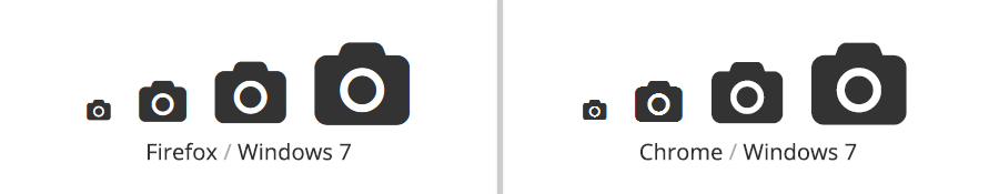
There’s not too much to be said about cross browser testing with icon fonts, except that it’s worth doing. However it’s not just to see whether or not the icons are legible in all browsers, it’s also to see how they render because sometimes they render rather strangely.
Fortunately this isn’t too common so it’s nothing to be majorly worried about. Although I have come across a bug in Safari on iOS7 where the icons wouldn’t be affected by line-height or if they were affected, it wasn’t correctly.
As I stated in the table above, Entypo has a few problems displaying properly. For example, in every browser I tested other than Safari on iOS7 the icons looked and worked great, however in Safari on iOS7 they would be either pushed down by the line height setting or not affected at all and be too far up.
Conclusion and Further Reading
Icon fonts are an amazing tool in the front-end web developers toolbox. I believe it’s something we should all be using since the support (in 2013) is pretty good and rendering on both Windows and Mac is now very sharp and crisp.
I’d recommend reading the below posts so you can either get more info on icon fonts or find more packs to use in your projects.
- Using Icon Fonts – Go Make Things
- Why And How To Use Icon Fonts – Vanseo Design
- The Big List of Flat Icons & Icon Fonts – CSS-Tricks
Tobias
June 5, 2017 at 11:15 am
Hi, really great article! Maybe you could help me?=)
I used this line of the code “-o-transform: scale(1);” to scale my icons in Opera properly, however it didn’t help me. Maybe it is because of specifically these icons, that I am using – https://mobiriseicons.com/
Is it possible that something is wrong with them? What do you think? And thanks for your article!