15 Ways to Improve an eCommerce Store (2 of 2)
- 8 min read
People Aren’t Stupid, They’re Lazy
Something you learn after studying the end users of an eCommerce store is that the majority of people are either too lazy or distracted to give their online activities 100% focus. They could be tired from work, in a crowded cafe or been up all night with a baby. You’ll never be able to accommodate every reason why someone isn’t putting in 100%, but don’t fret, there is something you can do.
Since people are either too lazy or distracted most of the time, you need to create an experience that helps them achieve their goals faster and with a minimal amount of effort. How do you do that? The best way is to continuously improve what you’re offering them. Don’t just be satisfied with the first version and expect it to work with no trouble, you need to continuously improve your service. There will always be ways you can improve what you’re offering, here are a few…
1.) Quick and Easy Checkout
Creating a quick and easy checkout process is a must. You may not think many people would so easily drop out half what through an online purchase but it happens much more than you think.
Sometimes it’s a design that doesn’t make the next step obvious and other times it’s a bunch of fees that don’t show up until the final screen. No matter what it is, these things are usually easy to fix with a little testing and common sense.
Put yourself into the customers shoes. Was it a simple and straightforward process? Could you improve it? Are there sites that do it better? Those are all questions you need to be asking yourself every time you test your checkout process. Make sure you test often and compare against your competitors so you’re always aware of what the customer wants.
2.) Proof of People Using Your Products

An emerging trend is to add a section of photos from people using or wearing your products directly below the product information. This is the best social proof you’ll ever have as people won’t just be reading testimonials but they’ll actually see other people using your products.
A great example of this is on one of my favourite stores, Jack of All Trades Clothing. Have a look at this page for a Joker Bat Mask T-Shirt. By seeing someone wearing the t-shirt it instantly makes you feel safer about buying the item.
3.) Show What’s “Hot Right Now”

In part one of how to Improve an eCommerce store I went over showing new items and how it can give relatively unknown products some much-needed exposure. This time I want to go over why showing what’s currently trending (popular) in your store is also beneficial.
I’ve mentioned social proof a few times over these two articles, which is the process of proving your products are good with things like testimonials and pictures. Trending items are another good example. By showing the currently popular items people feel safer about parting with their money.
Keep in mind that just because a large amount of people have bought something that doesn’t make it good. By adding star ratings to the products listing page you can help potential customers weed out the products that’ll only end up being a disappointment.
4.) Show Padlock Icons
![]()
There’s a simple trick user experience designers use to make things appear safer. It’s a pretty simple trick and in most cases doesn’t take very long to implement. That simple trick is the padlock icon.
The reason we design with icons is to give people an idea of what that specific section or link is about. Something more visually stimulating, like an icon, is a lot easier to interpret than having to read text and if people see something that reminds them of safety they instantly feel safer. This site uses the padlock icon technique on the newsletter sign up page.
5.) Simple and Advanced Site Search

It’s easy to overlook different types of users when it comes to site search. You’ll generally have two distinct types, basic and power users.
Basic users: These are the people who just want to type in a simple search term like “green dress” and find what they’re looking for. This can be a frustrating type of person to accommodate as they require an easier to use interface for search forms and results. This is also the most common type of user.
Power users: On the other hand you have people who are more than familiar with how search forms work. They generally expect to be able to search by order number, product SKU and use advanced operators like pluses, minuses and all the rest. These users are usually few and far between but since they usually know how to navigate your site you don’t have to worry so much about them trying to find what they’re looking for. Don’t take advantage of these people though, by ignoring their advanced search skills it could mean a lost sale. Every sale counts.
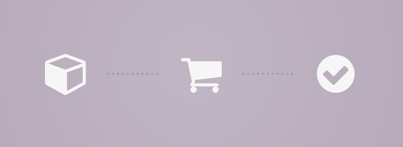
6.) Obvious and Helpful Order Confirmation

We’ve all placed orders on websites where it’s not clear if you’ve actually ordered something. eBay used to have a problem with this, there was no obvious way of knowing if you’d just completed the checkout form or if you were still going through the process.
The easiest way of showing a user that something’s just happened is by using a visual cue. In this case the best visual cue you can give is a big green check mark with straightforward text like “Your Order is Complete!”.
Another good thing to add to the confirmation page is a button that says “Finish”. It helps people confirm to themselves that they’ve finished and everything is complete. You want people to feel completely secure and in the knowledge that they’ve finished the process.
7.) Make the Most of 404’s

Any website guide will tell you to make a better effort on your websites 404 page and eCommerce is no different. In fact it’s even more important you use a helpful 404 page on a eCommerce store.
Imagine you’ve just clicked to check the basket and BOOM, 404 page. Most people will close down the tab holding your website, never to return again. Some people will understand it’s a simple mistake, but not everyone will be so forgiving. The best thing you can do is help them get back on track. Make sure you include links to important sections of your store like the basket, checkout, previous page and home page.
8.) Be Mobile Friendly

Being mobile friendly isn’t just “something you should do”, it’s actually a vital part of your business. Do a Google search for Inspirational Pixels on your mobile and you’ll see a little piece of text next to the search result for this site saying “mobile friendly”. Yes Google takes whether or not your site works on mobile devices into account. Having a responsive, mobile friendly website is most definitely in your best interests.
9.) Email and Username Login

The ability to log in using your email address and username may seem trivial but let’s think about it for a minute. People have countless accounts online ranging from social media to forums and message boards. It shows understanding if you let people login using their email address and username. People are more likely to remember their email address out of the two.
If you are set on only allowing one for logging in, make it with an email address. Nobody can remember every username they’ve got, especially since some people have slightly varying login details across different sites.
10.) Breadcrumb Navigation

Breadcrumbs don’t work on all types of sites. However an online store is somewhere they work incredibly well. Don’t make the mistake of thinking your users will simply “find their way” because this is the first sign you’re not putting enough effort into your stores user experience.
By using breadcrumbs you’re aiding your users navigation around your site. Always be thinking about how people will find your products, even when they’re on the site.
11.) Beef Up Security

This goes beyond using padlock icons everywhere it’s appropriate. By security I mean SSL encryption. If you’re not that familiar with internet security here’s a quick overview of SSL:
SSL stands for secure socket layer. It essentially creates a secure link between a server (the website) and the client (the web browser of someone using your site).
It’s definitely worth your time investing in an SSL certificate as it’ll make sure everything that’s used on your site, like credit/debit card information, is processed securely.
12.) Step by Step Order Process

Some online stores use a one step order process, however this can give potential customers a bad feeling because it appears there’s a lot more to do than there actually is. You’re essentially bombarding them with too much information.
The best thing you can do is break it up into smaller sections that are easier to digest.
Tip: Try not to make the mistake of having too many steps and scaring the user off.
13.) Have Multiple Filters and Sorting Options

Having multiple ways to filter your products is a must and generally a standard on most online stores. It helps people narrow down their search and makes them feel more in control.
It works much better the more products you have. If your online store only has 20 products, a huge amount of filters would simply be unnecessary.
14.) Discounts for Previous Customers

There’s no better way to get repeat business than by offering a discount to customers who have already ordered from you. Imagine their surprise when they open up their package or read their confirmation email to see a 20% discount on their next order.
People like getting discounts because they feel like they’re winning. Give discounts to customers as soon as they order. It’ll make them want to make another purchase. It’s an endless cycle if they get a discount for every next order and that’s exactly what you want. Repeat business is the key to a maintainable eCommerce business.
15.) Give it a Personal Touch

Far too many times people think you need to be corporate to appear professional. This is untrue. People are actually much more comfortable doing business with stores that come across as more friendly and personal.
Always write as though your sales copy is being directed at a specific person, because essentially it is.