The Building Blocks of a Good Design
- 6 min read
What Makes a Good Design?
Let’s start with what every web designer should take into account.
- Good readability: If any user viewing your site can’t easily read your content then you’ve already failed. If you think about the fact that most of the web is made up of text, you start to realise how important readability is.
- Consistent layouts and modules: This covers things like header placement, navigation design, content layout, tabs modules, accordion modules etc… Imagine if every tabs module looked different. Not a pretty picture.
- Consistent elements: This goes for links, buttons, text, lists, headings etc… Ties in closely with good readability and consistent layouts and modules. If your text is constantly changing shape and colour then you’re only confusing users and giving them a bad, undesirable experience.
- Visual hierarchy: You may or may not have heard of this one. Visual hierarchy, put simply, is when one element catches the user’s eye before another. Think a big red button before a paragraph of text.
1.) Good Readability
As I said above, readability is key if you want to make your design a success. It’s the foundation and core of how the site appears.
There are a few considerations to keep in mind when choosing a typeface. One of the first being “how is this going to look in a paragraph?”, “what about long vs short sections of text?”. The one part of the page where people will need excellent readability is the paragraphs.
Take Elliot Jay Stock’s blog for example, if he’d used a different typeface for the main body text then the readability of the posts would be completely different. I’m not saying it would be better or worse, just very different.
Also take a look at the line height, it’s quite a large amount compared to most sites. Elliot is one the best typographic designers I’ve ever seen, so I’d take note of how he presents his articles.
Spacing between sections of text is very important. For example, if you’ve got two paragraphs that have no spacing between them then it’s just a terrible reading experience for anyone on your site.
Headlines are easier to get right because they’re shorter and generally a lot bigger, so whatever font is being used will render much better on most screens. However that doesn’t mean you can spend less time and care when choosing the typeface for them.
An excellent example of typography is the personal blog of writer and entrepreneur, Adii Piennar. As you can see below it’s a very simplistic design aimed at doing one thing, being as readable as possible, and it does that one thing really well.
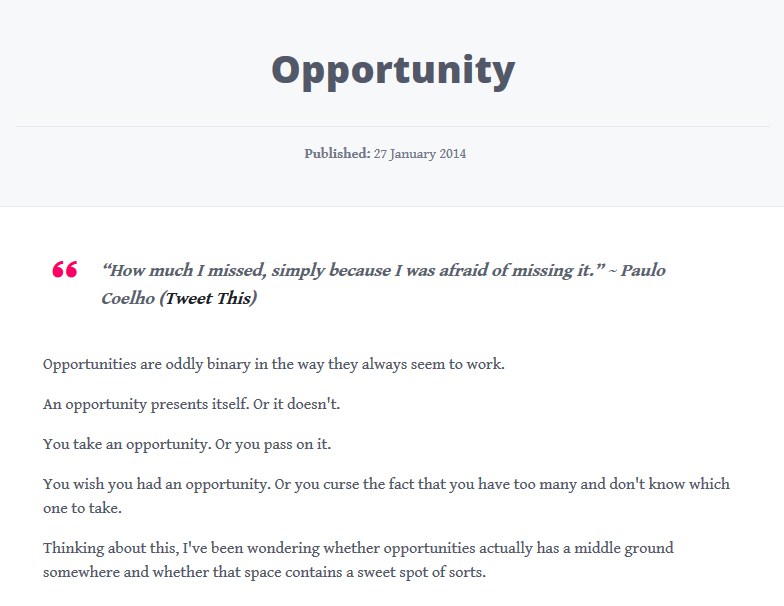
Being able to use typography effectively is an art, just as much as drawing and fighting are. To the untrained eye it just appears as text on the screen and nothing more, but when you start learning about typography and the true power it possess, you’ll start to understand why its strongest building block in web design.
2.) Consistent Layouts and Modules
When I write ‘Layouts and modules’ I’m referring to blocks of content within the website. As a reference take a look at Bootstrap, which is a front-end design framework with pre-built modules/components.
A page that presents an excellent example of good layouts and modules is the well known CSS-Tricks, created and run by the talented, Chris Coyier.
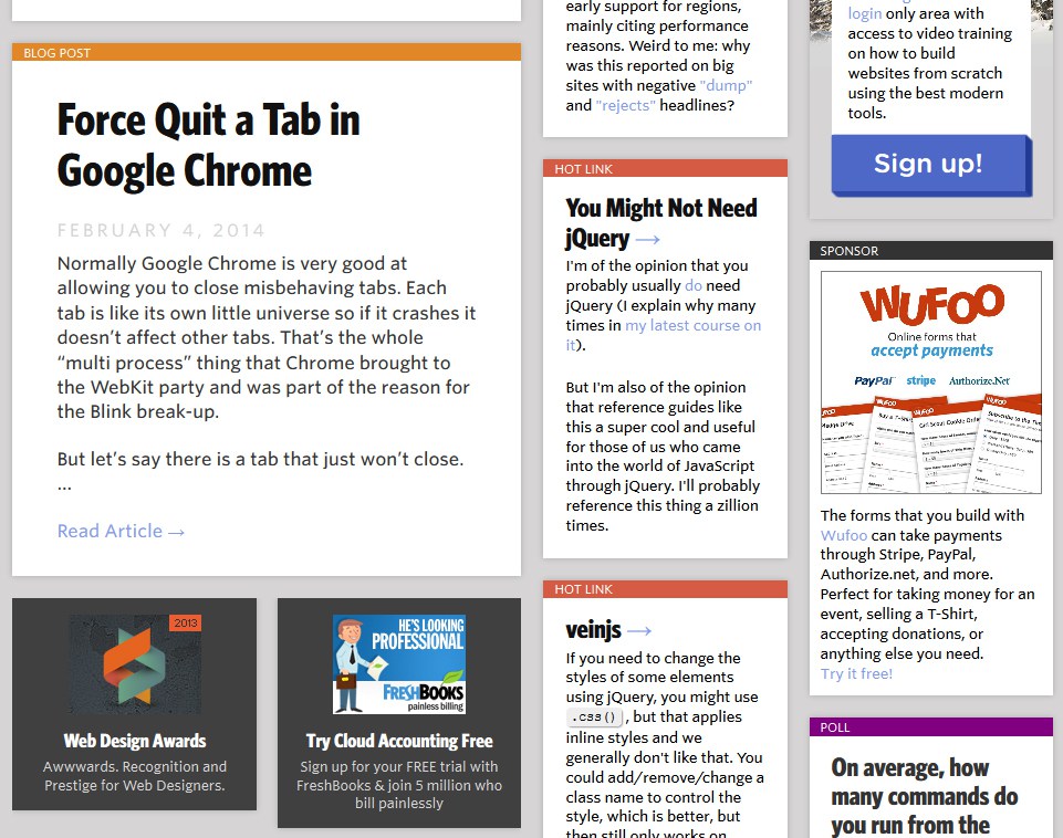
Although there is a lot going on here, Chris has done a great job of refining the layout into modular components which breaks up the content into scannable sections. Whenever I’m on the CSS-Tricks homepage I never have any trouble finding what I’m looking for, whether it’s the latest ‘hotlinks’, logging into The Lodge or voting in the poll.
The reason that having your content in specific sections is important is so users can find what they’re looking for. Keep in mind that when people come to your site they’ve come for a reason and usually have and end goal in mind. This morning I went on Buffer and signed up for an account. The reason I went to the site was to find out more about the product. I didn’t google “buffer app” just for the sake of it.
3.) Consistent Elements
When it comes to being consistent with element design, most people would recommend having all links the same color, a small number of button variations, typography set to a modular scale, (you see how the word ‘modular’ keeps popping up here?). All of those things are incredibly important and should be designed for from day 1.
However I’ve found an exception to one of those rules on the Treehouse Blog where the links to the author page, category page and comments are all different colors.
At first you may wonder why they’ve gone against best practices in favor of something different, well it turns out they’ve actually created a new best practice. By having certain links certain colours they let users easily scan the page to find what they’re looking for. Something to keep in mind is that it’s far easier to scan colors than text.
Keeping your elements consistent is invaluable. The end goal of any website should be to give users a good experience that will make them want to come back time and time again. I’m a firm believer that content is king, but if the design that supports the content is misleading or unhelpful in pushing the user towards their goal then they won’t be able to get to your content in the first place.
4.) Visual Hierarchy
When flat design comes into the picture, the visual hierarchy of the website can become lost and disorganised. Let’s take a look at a very popular web design blog, Specky Boy.
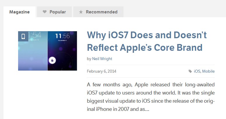
Firstly it pushes our eyes towards the image. When you place an image on a page people’s eyes are naturally drawn towards them which is why it pays to put images on the left, (seen here), rather on the right because people generally read from left to right, which makes scanning the page easier and ensures people are more likely to see the headlines.
Next we see the big headline, this is usually the deciding factor for many people whether or not to follow on and take a look at the post. That’s if they haven’t already clicked because the image looks to enticing to pass up.
If the headline only slightly grabs our attention, we’ll probably want to have a look at the excerpt text to find out more.
We may take a look at the date and comments to see how relevant and popular the posting is.
After that it’s unlikely we’ll look at anything else. However if the post is on a site which has many different contributors, readers may want to see if it’s by someone they know or someone who’s content they’ve read before.
Lastly there’s the category. Some people may be coming to Specky Boy to read about a specific subject. That’s where giving readers the post category (or categories) is invaluable because it might just convert those last few people who are on the fence about clicking.
There will usually be a lot of things fighting for the users attention, but if you can manage them well by using visual hierarchy then you’ll be helping your users out by giving them a great experience.
Conclusion
Overall there are A LOT of aspects to this whole web design thing we’re all so proud of doing. If you really dig deep it seems like an endless rabbit warren at times. Just keep in mind that that sometimes the smallest things make the biggest difference.