5 Great Ways to Increase Form Conversions
- 9 min read
The majority of websites you visit on a daily basis have forms on them. Whether it’s for contacting, signing up or buying there’s most likely one somewhere on every site you visit.
When you first start out designing websites it’s as simple as grabbing something from Wufoo or creating a few input fields and button. In reality so much more goes into an online form, you have to consider form length, input length, label orientation and so much more.
Getting your forms just right is a tricky business. Below are five great ways to increase form conversions and get more customers or users.
You might also like: Why Productivity Hacks Fail and Just Doing It.
Table of Contents
- Shorter is Usually Better
- Labels at The Top
- Make People Feel Safe
- Helpful Notifications
- Give People a Choice
1 Shorter is Usually Better
Short Forms
When designing a form it’s usually a best practice to keep it as short as possible. The reasoning behind this is that people don’t typing in a load of data. I’m sure at some point you’ve gone to a page with a form, maybe a sign up or checkout page, and have seen what looks like fifty different fields you have to enter information in to continue. The problem is the end-user becomes overwhelmed. It’s much easier to close the page and carry on with your day rather than fill it out.
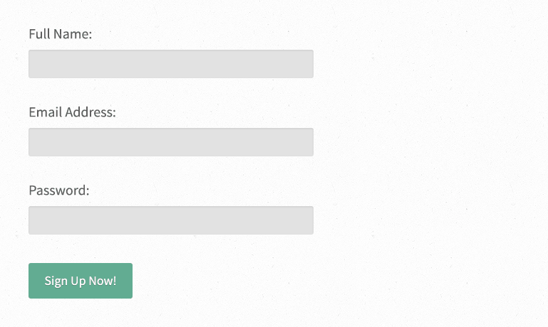
Try making the form shorter by only including essential information. You don’t need your potential users to type their email address and password twice. For example, if you have a form with the following fields you’re really not going to get as many people signing up:
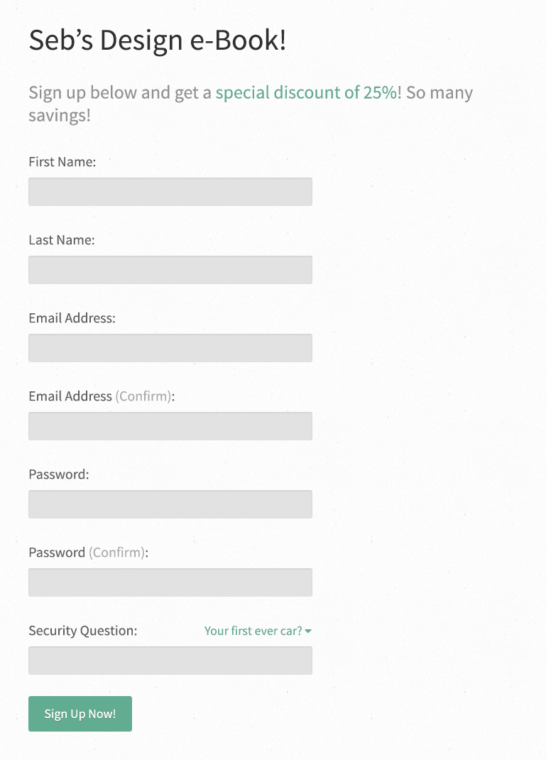
Let’s take that form and discard any fields that are not needed. First take a look at any fields that require typing something twice. People aren’t stupid so don’t treat them like they are. They know how to type their own email addresses and don’t want nor need to type it twice. The majority of the time people just use copy and paste anyway.
You could also get rid of typing a password twice, it’s a barrier to entry and isn’t needed anymore. Sure some people might type it wrong but if so they can just reset it. I understand some UX experts out there disagree on this so it’s really a matter of opinion but in my research it turns out that people do write it correctly most of the time.
Security question? This is useful on bigger sites but, for example, if Inspirational Pixels started a membership section, having a security question would be pointless unless there was some type of payment system. In my experience security questions are great for e-commerce sites because they make the user feel safer about their private information however on a simpler site it’s unnecessary.
Another technique I use on forms is to have the user enter their name in one input. There aren’t really a lot of circumstances where you need both the first and last name saved separately so just have it as one field and avoid a potential barrier to entry.
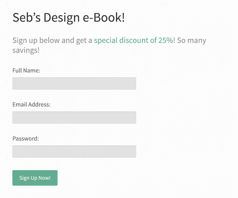
Here is the revised form, instead of 7 fields it now has 3 which is a pretty considerable saving.
Multi-Page Forms
There will undoubtedly be times when you need to get more information from someone. For example a checkout process that requires signing up, entering payment information and adding a postal/billing address.
This is the prefect opportunity to involve multi-page forms. Here is an example of a multi-step checkout process indicator:
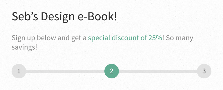
Imagine if all the information for your new account, postal address, billing address and credit card was all on one page. It would be a pretty huge page with a pretty terrible conversion rate.
The idea of shortening forms to the essentials should always be at the forefront of your designs but there are times when certain information is needed to complete the process, in those cases multi-page is the way forward.
Progress Loading Bars
If you really want to get those potential users converting try using a progress indicator like this:
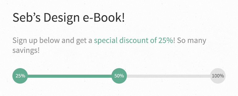
The reasoning behind it is actually a simple psychology idea. People love completing things to 100% but hate it up until they’re at 99%.
Ever played a game like GTA V or Batman: Arkham City? If you have you’ll know how many spaceship parts and Riddler trophies there are to find. The reason for this is that it keeps you playing longer because you want to see that little piece of text say 100% complete. You can use this technique to increase your form conversions too!
Let me know what sort of techniques you use when shortening forms below.
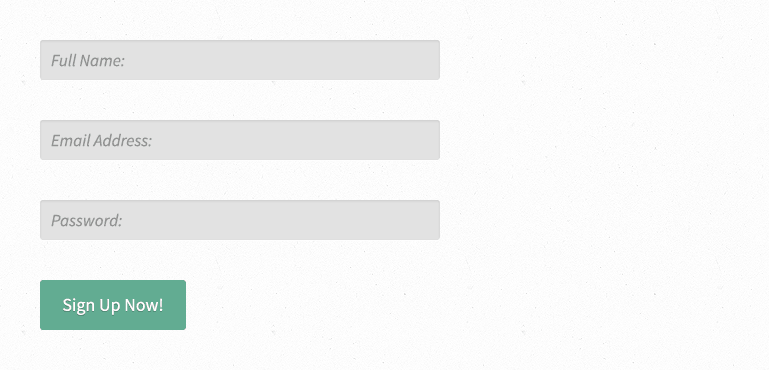
2 Labels at The Top
A few years ago there was some debate as to whether or not form labels should be at the side of the input, on top or inside of it (in the form of a placeholder).
When designing forms it’s tempting to go with what looks best at the time (remember this is subjective). Instead always be thinking of the end-user who’s going to be the one actually filling it out.
Over years of research and testing it’s now generally accepted as a best practice to put your form labels on top of the input fields. This makes it easier for people to scan their eyes down the form.
Going left to right, which is the case if the labels are to the side, makes it more difficult for people to easily scan through the form. Keeping people focused on filling in the form should always be one of the top goals you’re trying to achieve. You obviously can’t force people to fill the form in if they don’t want to but you can manipulate their behavior into doing what needs to be done.
Don’t read the word ‘manipulate’ and think it’s a bad thing. It’s actually beneficial if we can persuade people to fill in the form. They wouldn’t be on the sign up page in the first place if they didn’t have some intention of at least finding out more information.
Putting placeholders within the input fields is usually ok if it’s a search box, especially if the input or button has a search icon in it, (we use this technique here on IP in the header of this site). However be weary of placeholders as they essentially hide the input label from the user. If someone is filling in a form, clicks in the box, starts typing and suddenly gets a phone call or text they’re likely not going to remember what the placeholder said before it disappeared, which can hurt your form conversions. Just always take that into account when using placeholders.
3 Make People Feel Safe
At some point, sometimes everyday if you run a blog with comments, you have to deal with spam. Email spam sucks and people are very wary against it.
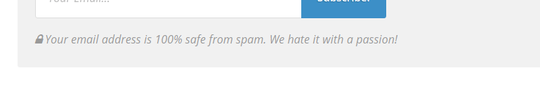
Another simple technique for enticing people to fill in your forms is by simply stating that their email address is safe. At the bottom of each post on this site there’s a call to action for the Inspirational Newsletter that says “Your email address is 100% safe from spam. We hate it with a passion!“. There’s even a little padlock icon next to the text to make it feel even safer and also draw the right attention to the text.
It may not seem like it’ll make much of a difference at first. People know you’re not a spammer, right? Wrong.
A persons email address is a very special thing. A few years ago email addresses weren’t as important but because of the amount of spam we all get on a daily basis people want to know they can trust you and this little technique makes them feel safer about giving you that information, which will improve your form conversions. Just like shortening the amount of inputs on a form this also creates one less barrier to entry, the users mindset.
4 Helpful Notifications
We all hate filling in a form only to be told we did something wrong. The biggest problem in the process is that we’re not told what we did wrong.
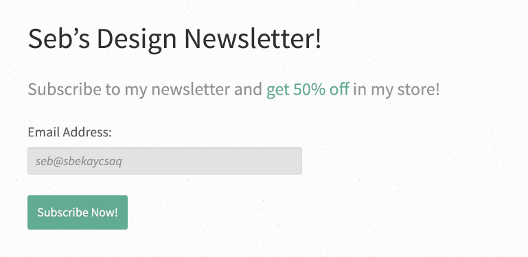
For example, typing in my email address like this would result in an error.
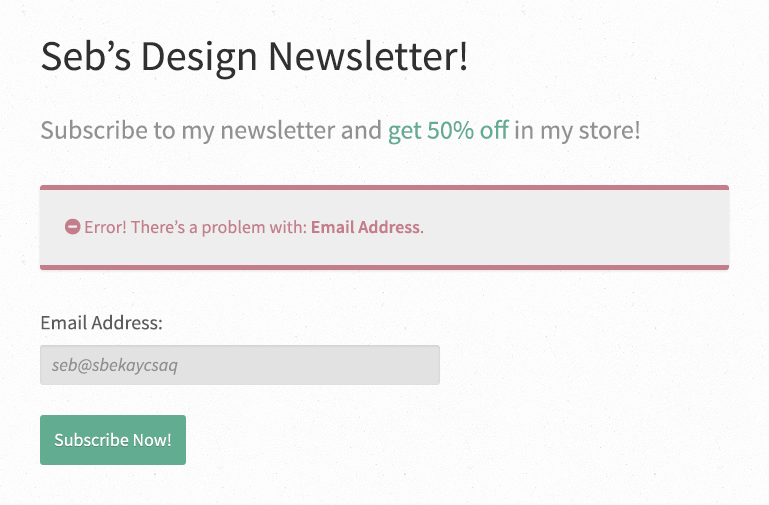
However if the error message comes up like this it’s not going to help the user solve the problem. It’s not such a problem in this case because there’s only one field. However imagine having a large form, like a checkout form, that wouldn’t be pleasant.

By specifically telling people what they did wrong it can tremendously speed up the time it takes to fill in the form, especially if it’s a tediously long one (read section one on shortening forms).
Below I’ve revised the error message to be a little more helpful. It tells the user exactly what to fix in order to move onto the next screen.
You could go one step further by also highlighting the corresponding boxes with a red border or even better, use inline validation. Inline validation is where the notifications show up next to the field(s) with the error.
5 Give People a Choice
Here on IP we have a button in the sidebar instead of a form. I got this idea from a webinar on how LeadPages grew there user base from 0 to 15,000 customers in just one year. It’s hosted by Tim Paige who is fantastic at what he does, which is ‘Conversion Educator’ at LeadPages. Basically he does a really good job on improving the UX of sign ups (there’s more too it, but that’s the general idea).
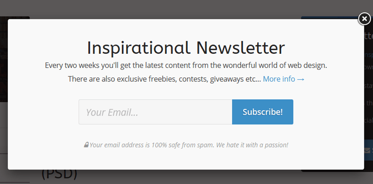
The idea is that by using a button which shows a popup box (like FancyBox or PrettyPhoto) instead of an outright form you’re giving the user a choice as whether or not they want to sign up which means when they get the popup they’re more likely than not to enter their email address since they initiated the form in the first place.
A word of warning with popup boxes though, never show it on page load as this is incredibly annoying, especially for first time users and can actually stop people clicking on links to your site. Even if you remove it people still expect it to be there which could mean you’ve lost that person forever.
This is a powerful idea and is working well for us here at IP. Recently we had a little drop in the amount of people signing up for our bi-weekly newsletter until I implemented the popup box idea that Tim suggests in the webinar.
I highly suggest watching the webinar by Tim because it’s a fantastic resource that covers a lot more than I mentioned above.
Conclusion amd Further Reading
Whether you’re trying to get email sign ups or purchases for you store, implementing these tried and tested methods is a great way to go. However, the above only scratches the surface on what you can do with a website form. I suggest doing your own research on a current project you have going and see what works for you when it comes to better form conversions.
I hope these 5 ways to increase form conversions has helped you. If so let me know in the comments below!
Below are a few resources that will help in your quest for better forms:
- How to go from 0 – 15,000 Customers in 12 Months – (Webinar) by Tim Paige
- Web Form Design: Showcases And Solutions – (Article) by Smashing Magazine
- 21 first class examples of effective web form design – (Article) by Graham Charlton
- Optimizing the Usability of Online Forms – (Article) by Paula Borowska