Tooltips in HTML and CSS
- 3 min read
The HTML
All you need for the HTML is an anchor tag (or any tag you like) with a child element. The child will be hidden by default when the page loads and only shown when the parent is hovered over.
<a class="tooltip" href="#">
Tooltip
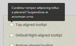
<span class="txt">Curabitur tempor adipiscing tellus a placerat? Suspendisse at accumsan urna.</span>
</a>The CSS
Parent Element
First you need to give the parent a relative value. That way the child element won’t sit at the top of screen but will instead stay “relative” to the parent, which in this case is the anchor link.
.tooltip {
	position:relative;
}
Child (Tooltip) Element
The code for the actual tooltip is a little more extensive.
- Width: You need to give it a set width otherwise it can get a little hairy when the length of the text changes from tooltip to tooltip.
- Padding: is required to make it more readable, otherwise it may blend too much to the current background.
- Display: is set to none so you can’t see it on the initial page load.
- Position: It’s absolutely positioned so it can be inside the parent without affecting any siblings or even the parent itself. The reason we don’t use actual positioning like
top:0px;orleft:0px;is so we can be more flexible when it comes to having the tooltip at the top, right, bottom or left. - Z-index: is set high so it stays above everything else. Anything with z-index automatically sits above everything else however I’ve set it high so it can be above other elements that also have a z-index.
- Other: The other values are just basic styling to make it look nice. Also I like to put
/* Type */in my CSS files to declare font styles, (in Sass I write it as// Typeso it doesn’t get rendered).
.tooltip .txt {
	width:200px;
	padding:10px 15px;
	display:none;
	position:absolute;
	z-index:1000;
	border-radius:3px;
	background:rgba(0,0,0,0.75);
	/* Type */
	font-size:12px;
	text-shadow:-1px 1px 0px rgba(0,0,0,0.2);
	line-height:150%;
	color:#fff;
}
Adding the Arrow
We’ll start off with having a base for our arrow that we can then position with more specific values, depending on whether it’s a top, right, bottom or left tooltip.
.tooltip .txt:before {
	width:0px;
	padding:0px;
	position:absolute;
	content:'';
}
Top, Right, Bottom and Left
You will realise that the code above doesn’t actually position the tooltip or show the arrow, that’s because it’s easier (and more maintainable) to have a separate class you can add to the end of .tooltip to set the position and show the arrow accordingly.
/* Top */
.tooltip.top .txt {
	bottom:20px;
	left:-10px;
}

.tooltip.top .txt:before {
	bottom:-5px;
	left:10px;
	border-left:5px solid transparent;
	border-right:5px solid transparent;
	border-top:5px solid rgba(0,0,0,0.75);
}

/* Right */
.tooltip.right .txt {
	top:-10px;
	left:20px;
}

.tooltip.right .txt:before {
	top:10px;
	left:-5px;
	border-top:5px solid transparent;
	border-bottom:5px solid transparent;
	border-right:5px solid rgba(0,0,0,0.75);
}

/* Bottom */
.tooltip.bottom .txt {
	top:20px;
	left:-10px;
}

.tooltip.bottom .txt:before {
	top:-5px;
	left:10px;
	border-left:5px solid transparent;
	border-right:5px solid transparent;
	border-bottom:5px solid rgba(0,0,0,0.75);
}

/* Left */
.tooltip.left .txt {
	top:-10px;
	right:20px;
}

.tooltip.left .txt:before {
	top:10px;
	right:-5px;
	border-top:5px solid transparent;
	border-bottom:5px solid transparent;
	border-left:5px solid rgba(0,0,0,0.75);
}
Now when we need specific placement we just use the html class like so and that’s where it’ll show up.
<a class="tooltip top" href="#">
	Tooltip
	<span class="txt">Curabitur tempor adipiscing tellus a placerat? Suspendisse at accumsan urna.</span>
</a>
Why No Default Placement?
The reason is simple, to keep the code modular, reusable and maintainable. Something I’m deeply passionate about. Although one thing to keep in mind about modular, reusable and maintainable code is that it’s up to you to decide what counts as maintainable.
I’m sure Harry Roberts of CSS Wizardry would find my code base and yours quite funny if we were to class it as maintainable, however we might find his overkill.
I respect Harry a lot, he’s actually the reason I code in a maintainable fashion. However one thing I always try to do it what works for me BUT I also make sure the code is to a set standard of maintainability.
In Conclusion
I could hand my code base over to someone else who codes in a completely different way, it may still be maintainable and modular but different all the same. That person can still use my code and edit and experiment with it without hassle.
Thanks for reading this short tutorial on creating tooltips in HTML and CSS. If you’d like more content like this, go ahead and check out the tutorials section!
Paul Scott
December 26, 2017 at 1:09 am
For the life of me, I cannot figure out where the white-colored round graphic comes from. The one on the left side of the text that you have to hover over, to get the tool tip (help). I would rather have a question mark, or other graphic, but I cannot see in your code where you are specifying the graphic that you are using. Please help. Thank you!
Neverlander
December 11, 2015 at 1:23 pm
Hi,
Can you explain how did you shape tooltip arrows?
Ramakrishna
March 30, 2015 at 9:23 am
Hi,
Actually my problem is when i am adding the tooltip(not this one) to my code it will appear in diiferent paces in different browsers like in chrome it comes pretty perfect while open in an firefox or IE or opera it moves on to the picture.present i upload the one that is no problem with tooltip but that is not responsive.So could you please give me a brief idea about how to work it well ?
Thank you
Seb Kay (Author)
March 30, 2015 at 9:54 am
If you post all your code over on JSFIddle, I’m more than happy to have a look at it and diagnose the problem for you 🙂
Vinoth
November 13, 2014 at 8:50 am
I like this website because of it’s greater look-and-feel.
Since, I am a beginner on these technologies, I prefer this type of sites where I get to see good UIs.
Let me come to this sample UI. I cannot see the ToolTipText for the ‘left-aligned-tooltip’ when I minimize the browser window. Especially, when I minimize the browsers left side to near to this panel.
Is this a bug? Or can’t we popup the tool tip text only to the viewport which is visible to the user/viewer?
Francisco Gálvez
June 26, 2014 at 10:55 pm
I think you forgot one important line of code…
; ) hope this help to others.
HGN
July 6, 2015 at 2:33 am
Thanks, you are right, without this :hover part, the tooltip doesn’t work.
Navdeep
June 26, 2014 at 1:15 pm
Great articles up here at InspirationalPixels, where were you this long?! Definitely gonna visit this site more often, good job 🙂