How to Create a Simple Alert with Sass
- 2 min read
If you’re not already using Sass in your projects, you could be saving yourself a lot of time. I won’t go into the pros and cons of a preprocessor like Sass in this tutorial because I’ve already written an article on getting started with Sass. I’ve also posted a round-up of 8 handy extends and mixins for working with Sass.
Let’s get into the nitty-gritty of today’s tutorial, how to create a simple alert style with Sass. We’ll be tackling the alert in two stages: Creating an extend with master styles and using that extend to style the actual alerts.
The HTML Structure
Since we’re using an extend for the master styling, it saves us from having to use multiple classes on our HTML elements. In this case we can use just one class like class="alert-warning-large" instead of something like class="alert warning large". It may seem the same, but it’ll save us some big specificity headaches down the road.
<!-- Small -->
<div class="alert-success-small">
	<p>This is a small <strong>success</strong> alert box. As you can see it's green.</p>
</div>

<!-- Defaut -->
<div class="alert-success">
	<p>This is a <strong>success</strong> alert box. As you can see it's green.</p>
</div>

<!-- Large -->
<div class="alert-success-large">
	<p>This is a large <strong>success</strong> alert box. As you can see it's green.</p>
</div>
Breakdown of the HTML
To start off with we have a default alert style which is under the class of class="alert-success". You’ll see there’s nothing added to the end of the class to change the size as this is the default style.
The reason I’ve chosen this as the default instead of starting at the smallest and going up is because the medium-sized alert will usually be the one used most. By doing things this way we’re making our lives a little easier by only having to specify the alert and type of alert, instead of having to set the size as well.
Other than that the HTML is pretty straightforward. If you’ve got any questions or suggestions on the HTML, please leave me a comment below.
The CSS/Sass Structure
The base of every alert is formed by an extend called %alert. By doing this we’re creating DRY code with our Sass.
One of the benefits to using DRY code is less bloat. It also makes maintaining/updating a lot easier down the road.
//----- Base Alert Extend
%alert {
width:100%;
padding:20px;
display:inline-block;
border-radius:4px;
p, &:before {
float:left;
}
&:before {
width:25px;
height:25px;
margin-right:10px;
display:inline-block;
content:'';
border-radius:1000px;
background:url('icon-sprite.png') no-repeat;
}
p {
color:#fff;
}
}
%alert-small {
padding:10px;
p {
font-size:12px;
}
&:before {
width:18px;
height:18px;
}
}
%alert-large {
padding:30px;
p {
font-size:24px;
}
&:before {
width:40px;
height:40px;
}
}
//----- Success
.alert-success {
background:#75aa61;
@extend %alert;
&:before {
background-color:#98bf89;
background-position:-47px 7px;
}
}
.alert-success-small {
@extend %alert-small;
@extend .alert-success;
&:before {
background-position:4px 5px;
}
}
.alert-success-large {
@extend %alert-large;
@extend .alert-success;
&:before {
background-position:-89px 13px;
}
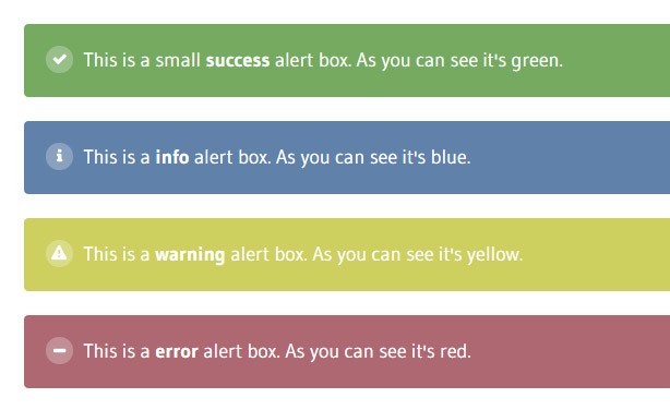
}To make this tutorial easier, I’ve included only the styling for the success (green) dialog box above. If you’d like the colors I’ve used for the others, here they are:
//----- Success (Green)
#75aa61

//----- Info (Blue)
#6181aa

//----- Warning (Yellow)
#cecf60

/----- Error (Red)
#ae6872
Breakdown of the CSS/Sass
The first thing to note in the Sass above is that there are 3 separate extends, not just one. The first holds the main alert styles, the second holds the smallest version of the alert and the third holds the large version.
On the main %alert extend I’ve added display:inline-block;. This is to stop the height of each alert breaking because it has floated child elements.
You’ll see I’ve used a pseudo :before element to pull in the icons. The icons I’ve used are from a simple sprite I created in Photoshop.
Conclusion
That’s a wrap! As you can see, it’s pretty straightforward creating a reusable alert component with Sass. While there are a few different ways to approach it, I’ve found this to be the most no-hassle way of creating something that’s maintainable and reusable.
I’d love to see how you’re creating alerts and other components with Sass (or LESS). Leave me a comment below with a link to a JSFiddle that demonstrates your code in action.
Adam McKenna
February 9, 2017 at 12:22 am
Hi Seb,
Great tutorial! Those alerts are gorgeous. I don’t suppose there is an SVG version of the sprite sheet?
Thank you in advance,
Adam
Dean Hidri
February 25, 2015 at 8:19 am
Hi Seb,
that’s one hell of a lot extends you’re using there. You could make it better with a handy mixin, that handles the stuff for the alert boxes you want to customize. Don’t use so much extends in one project. Hugo had a good post to that.