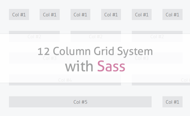
How to Create a 12 Column Grid System with Sass
- 6 min read
Grid systems are an incredibly powerful tool when creating any sort of website. There are many grid systems out there, such as Bootstrap and Zurb Foundation, but it’s actually a lot easier to roll one from scratch than many people think.
If you’re unfamiliar with anything in this tutorial, I highly recommend you have a read of Sass Projects for Beginners. Once you’re a little more up to speed, come back and I’ll show you how to make a 12 column grid system with Sass.
Just a heads up, you’ll need to use a little math in order to work out the spacing. Don’t worry though, once you get the basic idea of how to work out the spacing, you can have Sass automate the calculations for you. Then it’s easier than ever to change and evolve your grid system as your projects become more advanced.
1.) The HTML Structure
The HTML structure of our grid system is very straightforward. It doesn’t require any .first or .last classes, so it works really well with dynamic content like you get with WordPress.
Below is a snippet of how to use 2 columns, each spanning 6 spaces each. There isn’t much to say about the class names as they’re pretty straightforward. There is a total of 12 columns and you can chain any columns together in a row to make 12. A good example is a column 5 and column 7.
<div class="row">
	<div class="col-6">Col #6</div>
	<div class="col-6">Col #6</div>
</div>
Using The Grid
To use the grid, you just need to have all the columns in any given row add up to 12. In the example above, you’ll see 2 col-6 classes, which make 12. If you start with a col-5 class, then you need to either use a col-7 or whatever other number gets you up to 12.
Here are two examples of getting to 12 after starting with a col-5. As you can see, both columns add up to 12:
<div class="row">
	<div class="col-5">Col #5</div>
	<div class="col-1">Col #1</div>
	<div class="col-1">Col #1</div>
	<div class="col-1">Col #1</div>
	<div class="col-1">Col #1</div>
	<div class="col-1">Col #1</div>
	<div class="col-1">Col #1</div>
	<div class="col-1">Col #1</div>
</div>
Why ‘row’ and ‘col’?
The point of this grid system is to be nice and simple. That’s one of the reasons you don’t see any .first and .last classes anywhere.
In grid systems like Bootstrap, there are classes like .col-md-6. Here it’s a lot simpler, so we’re only going to use .col-6. If the grid system was more advanced, then some more classes would be necessary but luckily for us, it’s as simple as can be.
2.) The Sass Layout
The Sass is pretty straightforward here and most of it can actually work fine with good old CSS. The reason I’ve used Sass is to make the spacing a little easier to handle and keep the code a little more organised with some (very light) nesting.
Final Sass
//----- Extends
%clearfix:after {
	display:block;
	clear:both;
	content:'';
}

//----- Grid System
$grid-spacing:3%;

.row {
	@extend %clearfix;

	& + & {
		margin-top:$grid-spacing;
	}
}

[class^="col-"] {
	float:left;
	margin-right:$grid-spacing;
	-webkit-box-sizing:border-box;
	-moz-box-sizing:border-box;
	box-sizing:border-box;

	&:last-child {
		margin-right:0%;
	}
}

//----- Columns (Manual)
/*
.col-1 { width:5.583333333333333%; }
.col-2 { width:14.16666666666667%; }
.col-3 { width:22.75%; }
.col-4 { width:31.33333333333333%; }
.col-5 { width:39.91666666666667%; }
.col-6 { width:48.5%; }
.col-7 { width:57.08333333333333%; }
.col-8 { width:65.66666666666666%; }
.col-9 { width:74.25%; }
.col-10 { width:82.83333333333333%; }
.col-11 { width:91.41666666666666%; }
.col-12 { width:100%; }
*/

//----- Columns (Automatic)
.col-1 { width:(100% / 12) - ($grid-spacing * 11 / 12); }
.col-2 { width:(100% / 6) - ($grid-spacing * 10 / 12); }
.col-3 { width:(100% / 4) - ($grid-spacing * 9 / 12); }
.col-4 { width:(100% / 3) - ($grid-spacing * 8 / 12); }
.col-5 { width:(100% / 2.4) - ($grid-spacing * 7 / 12); }
.col-6 { width:(100% / 2) - ($grid-spacing * 6 / 12); }
.col-7 { width:(100% / 1.714285714285714) - ($grid-spacing * 5 / 12); }
.col-8 { width:(100% / 1.5) - ($grid-spacing * 4 / 12); }
.col-9 { width:(100% / 1.333333333333333) - ($grid-spacing * 3 / 12); }
.col-10 { width:(100% / 1.2) - ($grid-spacing * 2 / 12); }
.col-11 { width:(100% / 1.090909090909091) - ($grid-spacing * 1 / 12); }
.col-12 { width:100%; }
Grid Variables
There is only one variable set for the grid, and that’s $grid-spacing. As you can imagine from the name, it allows us to keep even spacing across the entire grid system. A big benefit here is that, as the grid becomes more advanced and more spacing elements are needed, we only need to change it in one place.
$grid-spacing:3%;Each Row
Each row of the grid is extended with a clearfix placeholder. This stops the age-old problem where parent elements break if they have floated child elements. You can read more about clearfixes here.
The & + & just means that when one row is followed by another, add some $grid-spacing to the top of the following one. It’s the same as .row + .row in CSS.
.row {
	@extend %clearfix;

	& + & {
		margin-top:$grid-spacing;
	}
}
Each Column and It’s Spacing
As you’ll see below, each column has some base styling. Take note of the [class^="col-"] part, especially the ^ before the ="col-". This is what’s called an “attribute starts with” selector, it means any element that starts with col- will be affected. It’s incredibly handy when you’re creating something like a grid when every column starts with the same prefix.
Each column also has a box-sizing of border-box. This is done to stop the width of each column changing if padding is added at any point.
[class^="col-"] {
	float:left;
	margin-right:$grid-spacing;
	-webkit-box-sizing:border-box;
	-moz-box-sizing:border-box;
	box-sizing:border-box;

	&:last-child {
		margin-right:0%;
	}
}
How to Work Out Each Column Size
Let Sass do it: If you don’t want to work this out every time the spacing changes, Sass can actually do the calculation for you. Scroll down a little and I explain how to let Sass handle the heavy lifting, then the width automatically adjusts when you change the value $grid-spacing. However, I recommend doing this once you know how it works. Here’s what the self-calculating code looks like below:
.col-1 { width:(100% / 12) - ($grid-spacing * 11 / 12); }I bet when you decided to make websites, you never accounted for all the math involved, am I right? Always keep in mind that, when calculating each column size, it has to add up to 100%.
It all depends on the $grid-spacing and the size of one individual column. From there it’s just some simple adding up. Here’s the guide to get the width of each column:
- To find the size of one column, get the
$grid-spacingnumber, in this case, it’s 3, times it by 11 and take it away from 100. That gives us 67. - Now divide your answer, it should be 67, and divide it by 12. You should get 5.583333333333333. That’s the size of one column out of 12 with 3% spacing in between each one.
- To get the sizes of the other columns it’s just a matter of adding another column, plus 3 spacing. So to get the width of 5 columns, you multiply 5.583333333333333 by 5 and times 3 by 4, then add them together. Test it out yourself, you should get the answer 39.91666666666667.
Tip: It can be pretty confusing to work this out at first. You need to take into account that, even though there are 12 columns, there are only 11 bits of spacing because the last one hits the very end of the row.
.col-1 { width:5.583333333333333%; }
.col-2 { width:14.16666666666667%; }
.col-3 { width:22.75%; }
.col-4 { width:31.33333333333333%; }
.col-5 { width:39.91666666666667%; }
.col-6 { width:48.5%; }
.col-7 { width:57.08333333333333%; }
.col-8 { width:65.66666666666666%; }
.col-9 { width:74.25%; }
.col-10 { width:82.83333333333333%; }
.col-11 { width:91.41666666666666%; }
.col-12 { width:100%; }
Let Sass Calculate it For You
The problem with the above code is that we have to painstakingly work out each column width. I’ve come up with a basic calculation for Sass to run for us, now we no longer have to work out each value every time $grid-spacing changes.
The below is probably going to be a little confusing if you jumped over the last section which explains how you actually get the width of a single column. Without knowing the above, you can’t create the calculation on your own. So I highly advise you read the above section before trying this bit, otherwise if it breaks you’ll be stuck.
How to calculate a single column width:
.col-1 { width:(100% / 12) - ($grid-spacing * 11 / 12); }You’ll notice that as we get higher, the divided number for $grid-spacing goes down. If you look carefully, this actually the number of single columns it takes to get to 12 from the given number. For example, the .col-5 width takes another 7 columns to reach 12, the $grid-spacing is divided by 7.
// That 2.4 value simply comes by dividing 12 by 7
.col-5 { width:(100% / 2.4) - ($grid-spacing * 7 / 12); }
Now that’s all well and good, but what about the others? Luckily for you, I’ve gone ahead and written them down. All you need to do is copy and paste:
.col-1 { width:(100% / 12) - ($grid-spacing * 11 / 12); }
.col-2 { width:(100% / 6) - ($grid-spacing * 10 / 12); }
.col-3 { width:(100% / 4) - ($grid-spacing * 9 / 12); }
.col-4 { width:(100% / 3) - ($grid-spacing * 8 / 12); }
.col-5 { width:(100% / 2.4) - ($grid-spacing * 7 / 12); }
.col-6 { width:(100% / 2) - ($grid-spacing * 6 / 12); }
.col-7 { width:(100% / 1.714285714285714) - ($grid-spacing * 5 / 12); }
.col-8 { width:(100% / 1.5) - ($grid-spacing * 4 / 12); }
.col-9 { width:(100% / 1.333333333333333) - ($grid-spacing * 3 / 12); }
.col-10 { width:(100% / 1.2) - ($grid-spacing * 2 / 12); }
.col-11 { width:(100% / 1.090909090909091) - ($grid-spacing * 1 / 12); }
.col-12 { width:100%; }
Final Thoughts
Wow, that was intense. It may take you a while to fully understand how to get each column number, it did for me. Keep at it, and you’ll get there, it just takes a little practice.
There is another side to this that we haven’t touched upon yet, the responsiveness of it. While the grid above isn’t responsive by itself, you can make it responsive with a few edits and some extra leg-work. Let me know in the comments if you’d like to see a follow-up to this tutorial showing how to make it responsive.
If you have any questions, please feel free to ask me in the comments below and I’ll do my best to answer/explain it to you.
Prayag
June 28, 2019 at 11:25 am
I was having some problems while calculating the width of each column. I am making a 12 column grid with each column having a margin-right of 1%. Now, I am not able to calculate the width of each column. Please help me. Thanks.
Romullo
April 29, 2019 at 6:27 pm
Simple and objective this tutorial .. and is being useful for min in 2019 ..tnks
nikesh
September 16, 2017 at 1:40 pm
Your tutorials is nice but I have analysed 2.4 calculation is 12 by 5 then it comes right value for .col-5.
Problem
// That 2.4 value simply comes by dividing 12 by 7
.col-5 { width:(100% / 2.4) – ($grid-spacing * 7 / 12); }
Correction
// That 2.4 value simply comes by dividing 12 by 5
.col-5 { width:(100% / 2.4) – ($grid-spacing * 7 / 12); }
Bridger
May 8, 2017 at 2:54 pm
I’m using your grid system for a project I’m working on.
I have a top/nav bar at the top, using a row.
Then I created another row, which will contain my sidebar(col-2) and my main content(col-10).
How can I get rid of the top margin on the 2nd row?
https://github.com/reifnotreef/Web-App-Dashboard
Bridger
May 8, 2017 at 2:56 pm
Welp, I just changed the base styling in the “& + &” to margin-top: 0; and it worked.
I tried that earlier but it moved the column to the right hand side of the page, can’t reproduce that now so I’ll chalk it up to user error!
Jaymes Young-Liebgott
April 4, 2017 at 12:55 am
Thank you, this was a good starting point for me to make a Flexbox grid system using Sass. I took it to the next level and added breakpoints. I also used Sass maps and functions and managed to keep my code under 100 lines. I’ll added to the Laboratory section on my site in a couple of days. Thanks again for a nice starting point.
Basu
February 24, 2017 at 9:03 am
nice work !! help me to understand grid much better complete the remaining part and i would love to follow it.
Ashish Bhutani
March 16, 2016 at 7:11 am
Thank You For Such A Nice Tutorial!
Andrés
May 1, 2015 at 6:05 pm
@SebKay If I want 2 columns more inside of a ‘col-6’ for example. How can I do to have the same grid-spacing? I tried but the grid-spacing between this two columns is 1.5%. One way to solve this is adding an extra class to this two columns.. but I don’t know if the best way to do it.
Thank you so much!!
Andrés
May 14, 2015 at 9:48 am
Hello @@SebKay
Sorry For bother you. Any update for this topic?
Thank you so much!!
Barry
May 24, 2015 at 7:42 pm
I’m not sure I understand 100% but you’re trying to add two more columns to the col-6 row? If this is what you’re trying to do, I would suggest using col-8 instead of col-6 so you can have 8 elements in the row.
Andrés
May 1, 2015 at 2:38 pm
@SeKay Thank you so much for your tutorial! 😀
I’m looking forward for the responsive tutorial!
tkt
April 21, 2015 at 7:49 am
It would be great if u can write tutorial how to make this grid responsive. In any case thank man!
tkt
April 16, 2015 at 2:37 pm
Nice tutorial!
Paul Graham
April 8, 2015 at 9:48 pm
Your code is not working right because it’s not wrapped in pre tags. All the tags are being sanitized.
Seb Kay (Author)
April 9, 2015 at 7:27 am
Thanks for catching that! Looks like a plugin is causing the issue. I’ll get it fixed ASAP.
Wil Goolsby
April 15, 2015 at 6:05 pm
Any idea when you’ll have this fixed?
Seb Kay (Author)
April 16, 2015 at 7:50 am
All fixed now. Sorry about that! 🙂
Seb Kay (Author)
April 8, 2015 at 8:10 pm
Thanks for the positive feedback! I’ll get working on some responsive styles 🙂
quinn
April 7, 2015 at 4:27 am
Good work! pls make a responsive tutorial!
Michael
April 6, 2015 at 4:45 pm
Great tutorial. Being a novice I would love a follow up on making it responsive.