Creating a Responsive Menu with HTML, CSS & jQuery
- 4 min read
Today I’m going to show you how to create a responsive menu with HTML, CSS and jQuery. I’m going to go over how to style the menu, using media queries and how to make the hamburger button toggle the menu.
Table of Contents
- Skip to the HTML
- Skip to the CSS
- Skip to the jQuery
You might also like: Creating a Dropdown Menu with HTML & CSS
1.) Structuring The HTML
Complete HTML
<nav class="menu">
<ul class="active">
<li class="current-item"><a href="#">Home</a></li>
<li><a href="#">My Work</a></li>
<li><a href="#">About Me</a></li>
<li><a href="#">Get in Touch</a></li>
<li><a href="#">Blog</a></li>
</ul>
<a class="toggle-nav" href="#">☰</a>
<form class="search-form">
<input type="text">
<button>Search</button>
</form>
</nav>HTML Explained
The elementnav is the housing of the entire menu and the class of menu will be the starting point for all CSS selectors.
<nav class="menu">

</nav>
An unordered list, holding all the menu links, has a class of active which is used to toggle it from visible to hidden.
<ul class="active">

</ul>
The list item that is currently active, for example, the page you’re on, is highlighted through CSS by using the selector current-item.
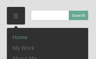
<li class="current-item"><a href="#">Home</a></li>A class of toggle-nav has been added to the anchor link between the ul and form so it can be hidden or visible depending on the window size, I cover this below using media queries. It also uses the Unicode symbol of three lines, e.g. ☰.
<a class="toggle-nav" href="#">☰</a>A basic form with an input and button is used as an example so the content styles can change depending on the window size.
<form class="search-form">
	<input type="text">
	<button>Search</button>
</form>
2.) Styling with CSS
Complete CSS
/*----- Toggle Button -----*/
.toggle-nav {
	display:none;
}

/*----- Menu -----*/
@media screen and (min-width: 860px) {
	.menu {
	width:100%;
	padding:10px 18px;
	box-shadow:0px 1px 1px rgba(0,0,0,0.15);
	border-radius:3px;
	background:#303030;
	}
}

.menu ul {
	display:inline-block;
}

.menu li {
	margin:0px 50px 0px 0px;
	float:left;
	list-style:none;
	font-size:17px;
}

.menu li:last-child {
	margin-right:0px;
}

.menu a {
	text-shadow:0px 1px 0px rgba(0,0,0,0.5);
	color:#777;
	transition:color linear 0.15s;
}

.menu a:hover, .menu .current-item a {
	text-decoration:none;
	color:#66a992;
}

/*----- Search -----*/
.search-form {
	float:right;
	display:inline-block;
}

.search-form input {
	width:200px;
	height:30px;
	padding:0px 8px;
	float:left;
	border-radius:2px 0px 0px 2px;
	font-size:13px;
}

.search-form button {
	height:30px;
	padding:0px 7px;
	float:right;
	border-radius:0px 2px 2px 0px;
	background:#66a992;
	font-size:13px;
	font-weight:600;
	text-shadow:0px 1px 0px rgba(0,0,0,0.3);
	color:#fff;
}

/*----- Responsive -----*/
@media screen and (max-width: 1150px) {
	.wrap {
		width:90%;
	}
}

@media screen and (max-width: 970px) {
	.search-form input {
		width:120px;
	}
}

@media screen and (max-width: 860px) {
	.menu {
		position:relative;
		display:inline-block;
	}

	.menu ul.active {
		display:none;
	}

	.menu ul {
		width:100%;
		position:absolute;
		top:120%;
		left:0px;
		padding:10px 18px;
		box-shadow:0px 1px 1px rgba(0,0,0,0.15);
		border-radius:3px;
		background:#303030;
	}

	.menu ul:after {
		width:0px;
		height:0px;
		position:absolute;
		top:0%;
		left:22px;
		content:'';
		transform:translate(0%, -100%);
		border-left:7px solid transparent;
		border-right:7px solid transparent;
		border-bottom:7px solid #303030;
	}

	.menu li {
		margin:5px 0px 5px 0px;
		float:none;
		display:block;
	}

	.menu a {
		display:block;
	}

	.toggle-nav {
		padding:20px;
		float:left;
		display:inline-block;
		box-shadow:0px 1px 1px rgba(0,0,0,0.15);
		border-radius:3px;
		background:#303030;
		text-shadow:0px 1px 0px rgba(0,0,0,0.5);
		color:#777;
		font-size:20px;
		transition:color linear 0.15s;
	}

	.toggle-nav:hover, .toggle-nav.active {
		text-decoration:none;
		color:#66a992;
	}

	.search-form {
		margin:12px 0px 0px 20px;
		float:left;
	}

	.search-form input {
		box-shadow:-1px 1px 2px rgba(0,0,0,0.1);
	}
}
Standard CSS Explained
Don’t get put off if it looks like a lot of CSS. Here’s a rundown of what’s going on:
Firstly the button .toggle-nav is hidden.
.toggle-nav {
	display:none;
}
The menu has styling applied but by using a media query of min-width we can specify that the styling will only apply until the window is equal to or more than 860px.
@media screen and (min-width: 860px) {
	.menu {
		width:100%;
		padding:10px 18px;
		box-shadow:0px 1px 1px rgba(0,0,0,0.15);
		border-radius:3px;
		background:#303030;
	}
}
rgba(0,0,0,0.5) is used on a few items in the CSS. RGBA stands for Red, Green, Blue and Alpha. Alpha means the transparency/opacity. For example, an alpha of 0.6 would be 60% opacity but an alpha of 0.06 would be 6% opacity.
text-shadow:0px 1px 0px rgba(0,0,0,0.5);The selector :last-child is used to specify that the last list item will have no margin applied to it, otherwise as the window gets smaller the search form would go onto the next line before it’s supposed to.
.menu li:last-child {
	margin-right:0px;
}
The transitions in the menu, for example, the fading of colours from grey to green, use the standard transition. However, if you’re supporting older versions of browsers you may want to use prefixed code. The code is mostly the same however you prefix the transition like so:
Webkit: -webkit-transition:;
– Firefox: -moz-transition:;
– IE: -ms-transition:;
– Opera: -o-transition:; – Please note that Opera now runs on Webkit so this one is outdated but still good to know.
transition:color linear 0.15s;Responsive CSS Explained
A little like before with .menu when min-width was used we’ll now be using max-width which does the opposite. The styles within a max-width media query will only take effect once the window gets to a certain size. This is the most common type of media query.
The first breakpoint is set at 970px and shortens the input in the .search-form. This is a useful technique when you don’t want to start hiding the menu but need to make some changes so the styles don’t break.
@media screen and (max-width: 970px) {
	.search-form input {
		width:120px;
	}
}
The second breakpoint is set at 860px and houses the majority of the responsive styling. The .menu is given a position of relative so the ul can be positioned absolutely inside of it.
.menu {
	position:relative;
	display:inline-block;
}
To hide the menu and help the jQuery the class .menu ul.active is hidden. This comes into play when you toggle the class .active with jQuery.
.menu ul.active {
	display:none;
}
Adding the arrow to the top of the ul is achieved using the pseudo element :after. Don’t forget to always add content:''; to any pseudo-element or else it won’t show up.
Positioning of the arrow is achieved using absolute positioning and CSS transforms, more specifically translate. The values of 0% and -100% state 0% from the left and -100% from the top.
.menu ul:after {
	width:0px;
	height:0px;
	position:absolute;
	top:0%;
	left:22px;
	content:'';
	transform:translate(0%, -100%);
	border-left:7px solid transparent;
	border-right:7px solid transparent;
	border-bottom:7px solid #303030;
}
The toggle button and search form then just use some basic CSS styling to change things around a little.
3.) Toggling with jQuery
Complete jQuery
jQuery(document).ready(function() {
	jQuery('.toggle-nav').click(function(e) {
		jQuery(this).toggleClass('active');
		jQuery('.menu ul').toggleClass('active');

		e.preventDefault();
	});
});
jQuery Explained
The jQuery starts off with a click call on the button .toggle-nav. The e stands for event. You could use any name you like but it’s standard to use either e or event.
jQuery('.toggle-nav').click(function(e) {

});
Then you toggle the active class on that button .toggle-navand the ul in the menu. You could combine this into one line but for the sake of this tutorial, it’s best to keep them separate so you can clearly see what’s happening.
jQuery(this).toggleClass('active');
jQuery('.menu ul').toggleClass('active');
Finally, you tell jQuery to prevent the default behavior of the .toggle-nav button. Since it’s actually an anchor link it’ll put a # the address bar and jump the page to the top if we don’t remove its default behavior.
Conclusion and Further Reading
Going responsive is hard. It takes a lot of research and practice to get right. I hope this tutorial has helped your understanding of how to implement a responsive navigation menu into your projects.
If you have any questions or comments just leave them below and I’ll get back to you ASAP.
Here are a few resources that should help:
- Responsive Web Design (Article) – A List Apart
- Media Queries for Standard Devices (Snippet) – CSS-Tricks
- Responsive Web Design (Book) – Ethan Marcotte
You might also like: Create a Fading Popup Modal with jQuery
Siggi
February 5, 2021 at 1:27 pm
Hi,
i´m german and i like this menu. But i looked for the source.zip and i could´nt find.
Can i download the code ?
Kevin
June 9, 2020 at 2:05 am
Hi, I am using your Nav bar and I have everything working fine but the toggle doesnt seem to work and the links are always on when I shrink the screen to make the hamburger icon appear. I am not sure what I am doing wrong and I cant find an answer anywhere, thanks 🙂
Antonio Newlands
September 21, 2019 at 1:17 am
Really cool, but where’s the download link? Thanks.
E Sanchez
August 7, 2019 at 2:12 am
Exactly what I needed. The little arrow that almost drove me nuts is a mystery no more.
Thanks a lot!
ipendar
July 29, 2018 at 4:58 am
that was very nice..
thank you
lalvadiya rajesh
July 12, 2018 at 12:57 pm
i just want to say thanks for your response its work very good,
for more snippets also visit : https://nicesnippets.com
Ruben
April 14, 2018 at 7:03 am
This looks like a really clearly laid out how to – but all the html snippets tags have been turned into > < which makes it too hard to read :/
Mike
February 12, 2018 at 3:30 pm
Excellent – thank very much for this. Helped me create a pop-up menu on my site, along with the little ‘arrow’ pointing at the button…. I long wondered how this was done… until now.
Peter
February 3, 2018 at 10:56 pm
Amazingly clear explanation. The example is so much better than the one on W3 Schools. I have one question though:
When the menu is a footer menu stuck down at the bottom, how do I get it to pop up instead of down below the bottom of the screen?
chris
August 19, 2017 at 2:12 pm
I cant get the jquerry to work i have it in a separate file. right now everything works but when responsive the toggled menu keeps trying to open the index page up
Jordan
January 18, 2018 at 11:44 am
Lol right? Everything is laid out well but I don’t know what is with these tutorials not fully working. I have the proper jQuery files in the tags and everything copy and pasted. But the function does not even work! Whenever I click the menu button on mobile view, it does not react at all or open up the ul li menu. Jesus Christ these tutorials keep wasting my damn time.
Jordan
January 18, 2018 at 11:48 am
So for whatever reason, you may have to Ctrl + F5 to refresh your browser. The browser doesn’t sense any significant changes so when you reset, it works. Had me salty for a moment haha. Thank you for the tutorial. the jQuery is an unfamiliar topic for me.
Antonio Newlands
November 25, 2019 at 8:43 pm
O menu não abre no mobile, somente no pc. O código está assim:
Home
My Work
About Me
Get in Touch
Blog
☰
Search
O que está havendo?
Grato.
Ron
July 11, 2017 at 6:15 pm
Thank you very much for the very clear and in detail examples! really helpful and as a very beginner its taught me a lot!
Pravin
June 19, 2017 at 10:51 am
I love the code, but want one more functionality. For smaller screen, search box should resize to the width of browser i.e. toggle button & search box in a 1:4 ration
Kosta
May 14, 2017 at 12:48 pm
Hey,
Trying to get this working for my website. Works great as is but I’m having trouble making a small modification to it.
I need to have two lists with the second one floating to the right which works when its expanded but when it collapses the two lists stack on top of each other when I click on the hamburger.
I’m guessing it is because of the “position: absolute” in the responsive section .navbar ul:after but I don’t know how to fix it so it works.
Any advice would help a ton
John
May 6, 2017 at 4:58 am
Hey, I coppied the code as it is and when I loaded up my site the button would not do anything. I have the js file properly called and everything looks the same. Not too sure why this is happening or if anyone has a solution.
Archit
June 8, 2017 at 11:26 am
I also had this problem but then realized that for .toggle-nav, I was using .toggle-nav:active instead of .toggle-nav.active
Maybe you had the same issue.
Debora Ermel
July 7, 2017 at 12:02 am
Did you add the path to jquery in the head??
Johan
March 20, 2017 at 5:33 pm
Hi,
Is there a way to close the menu when you click on the page and not on the menu?
Ivan Conway
February 13, 2017 at 6:51 am
Thank you for the great tutoria. I have managed to design a nav bar based on your tutorial however, I am unable to achieve two changes.
(a). I am unable to change the height of the nav bar.
(b). Unable to change the font colour of the text within the nav bar.
Would appreciate a little help with this please.
Ivan
Abidin Burak
October 10, 2016 at 3:00 pm
Thank you very much, its very helpful.
Dan
September 3, 2016 at 9:11 pm
Oops, forgot to use the html brackets.
“Ensure to enter in your
the following:Dan
September 3, 2016 at 9:09 pm
For the life of me I couldn’t understand after putting everything together how the responsive menu would work fine on the computer browser here, but not on an iPhone or Android phone. Figured out the solution that may be of use to those who don’t know (maybe its common knowledge for many, I’m just getting back into web programming from a 5 year hiatus).
Ensure to enter in your tag the following:
Ravi Sah
July 22, 2016 at 12:14 pm
Very Nice i will try this code, i am search for the same.
Thanks!!
ravi
Adeline
May 18, 2016 at 10:42 pm
I’m repeating my comment, edited slightly differently, because the one I’ve just submitted does not show the html elements I was referring to (please feel free to remove it!). So here it is:
Great tutorial! Thanks a lot for the article and the demo. Two related questions:
1) Right now the toggle-nav element is an anchor link. Would it be ok to change this element to something else, e.g. a div?
I’ve tried it and it seems to work, but am I missing something?
The only downside I see is that, during hover, the cursor would not change as it usually does on a link. Any other potential problems?
2) If we were to use a div (instead of an anchor link) for the toggle-nav element, can we remove e.preventDefault() from the javascript?
Thank you,
Adeline
David
April 7, 2016 at 1:08 am
I’ve been looking for this for a while. It worked great, thanks. Unfortunately I have run into a problem. I would like to have the drop down menu box to have an opacity of 20%. That way you would be able to see whats behind it when it goes down. I was able to make it work using
The only problem is that the text also had an opacity of 20%. Is there anyway to have just the menu box transparent but the type in the menu to stay 100%?
Sammie
April 28, 2016 at 1:28 pm
Don’t use global opacity. You can use rgba in the background-color.
Same for the bubble-arrow in
.menu ul:afterSharif Hamdy
March 17, 2017 at 9:45 pm
yeah so, it doesnt work
Umair Hassan
March 4, 2016 at 12:31 pm
my navigation menu exat run but i face a problem.
when my webpage minimize the 768 width.
appear a 100% width menu bar bt you click on everywhere of icon . icon run this is nit good.
but i want users click on the icon bar then show the menu list .
help me….
Someone
January 27, 2016 at 9:38 pm
Hi
Thank you for this tutorial but good practice to do a space after every CSS property.
For example:
width:[SPACE HERE]100px;
mila
December 15, 2015 at 10:05 am
I don´t understand, where do you integrate jquery….
Is it work with this?
thanks for ur help.
Beso
February 13, 2016 at 7:48 am
Perhaps its late for a reply but may be others wondering the same thing so explaining it below:
Paste the jQuery code to a notepad file then save as jquerymenu.js
then add it to your html page right before like this:
Marcel
December 3, 2015 at 12:22 am
Very well explained tutorial. I managed to figure it out and made some tweaks for mobile. A job well done!
amar
September 21, 2015 at 9:45 am
how to make Responsive Sidebar Menu for multiple devices
Devi Prasad
August 27, 2015 at 7:11 pm
Hi !!! I am new for the web programming. Please suggest how and where to add .css file, jquery file in html fiel. Please suggest….
chan
September 10, 2015 at 4:46 am
you can learn the basic at w3schools.com
Musarrof
August 1, 2015 at 7:26 pm
Your tutorial is not helpful, why don’t you explain how and where i will post Jquery. Please try to post helpful and describe clearly everything.
Thanks.
xXWeebleWobbleXx
February 15, 2016 at 3:24 pm
You put your jQuery within script tags just before the closing body tag in your html.
Eskarias
July 9, 2016 at 6:02 pm
You put it into javascript file (.js)
If you don’t know what that is then you’re way out of your league trying to do this type of menu.
Roger
June 25, 2015 at 7:57 pm
I had content in mt section that was covering my menu while being viewed on a small mobile device.
This sounds weird and awful, but I had to add the following hack to make this menu work…
First, after I closed the nav tag, I added this
Second in the jQuery function just before calling preventDefault, I added this block of code.
if (/Android|webOS|iPhone|iPad|iPod|BlackBerry|IEMobile|Opera Mini/i.test(navigator.userAgent)){
if ($(this).hasClass(‘active’)){
$(“#menu_spacer”).css(“height”,$(“nav.menu”).css(“height”));}
else{
$(“#menu_spacer”).css(“height”,0);}
}
This forced the DOM to add space for the menu instead of having my main content cover it.
Roger
June 27, 2015 at 1:23 am
<div id="menu_spacer"><p> </p></div>
I also changed the if condition to
if ($(“a.toggle-nav”).css(“display”) != “none”){
-Roger
Nick
June 18, 2015 at 3:01 pm
Hi, is there a way to add a branching menu to your code at all? One of my menu tabs should branches off and I’m not sure how to adapt what I have to what you have 🙂 Thanks.
Luis
June 12, 2015 at 9:24 pm
Can somebody help me, I try this to my website as a test, but didn’t work, I tried to copy and paste full code, full HTML, full CSS & full Javascript into HTML file and still not working, Why is happening because is the full code displayed here. Thanks
Luis
June 12, 2015 at 9:27 pm
I mean, when you press the toogle didn’t display anything
Jean-Paul Hupe
June 16, 2015 at 9:35 am
I do not understand why the author did not answer you … …
In the section, you must declare the jquery elements, and in the right order:
… …
Buhle Seya
June 30, 2020 at 11:49 pm
Hi there,
I seem to be having a problem with the toggle of this menu? I’ve added the .js file to the HTML.
Ive edited the .js file to this:
jQuery(document).ready(function() {
jQuery(‘.toggle-nav’).click(function(e) {
jQuery(this).toggleClass(‘active’);
jQuery(‘.menu ul’).toggleClass(‘active’);
jQuery(‘.menu a’).click(function(e) {
jQuery(this).toggleClass(‘active’);
jQuery(‘.menu ul’).toggleClass(‘active’);
});
});
});
Thanks for the tutorial and help. x
Derek Green
May 15, 2015 at 4:37 pm
Hi. Is there a way to automatically hide the Unicode “three line” drop-down menu when a user clicks a list item? At the moment I have to return to the “three line” symbol and click it again to close the drop-down menu. Thanks in advance for any thoughts or assistance.
Seb Kay (Author)
May 18, 2015 at 8:36 am
Are you talking about closing the dropdown menu by clicking outside the menu, and not just on the button itself?
Derek Green
May 18, 2015 at 2:54 pm
Yes, I guess I am. At the moment when I click on “Contact” in the menu – that I’ve created from your tutorial and code – I go to the contact information that I’ve put into the footer of the same page. However the drop-down menu remains open. I’d like the drop-down menu to disappear, so the user has to click the Unicode icon to reveal it again. Is this possible?
Seb Kay (Author)
May 20, 2015 at 7:43 am
Yes of course, I understand now. It should just be a matter of changing the JS to something like this:
Let me know if that works out for you.
Derek Green
May 20, 2015 at 2:10 pm
Hi Seb. Thanks for this. Yes, the adapted JS now closes the drop-down menu perfectly. It’s just what I wanted. However I’ve now lost the link functionality. So, when I click “Contact” in either the menu bar or the drop-down menu, the page no longer scrolls down the footer which contains the contact info.
Seb Kay (Author)
May 22, 2015 at 7:39 am
I see the problem, my fault, sorry about that! You just need to have the click functionality for the
.menu aon its own and remove thee.preventDefault();. That stops the links from working.Derek Green
May 22, 2015 at 1:23 pm
Thanks for this Seb. The menu and links work perfectly now. I’ll be adding a credit, my thanks and a link to inspirationalpixels.com on the new site. Hopefully it’ll be ready to launch sometime in early June.
Nez
September 8, 2015 at 9:53 am
Hi,
In your next reply, what did u mean by ‘have the click functionality for the .menu a on its own’? Can you please showcase how its done!
Thanks
Lucas
May 7, 2015 at 6:12 pm
Where should I put this jquery code? I tried everything and the menu does not show the menu items when in responsive mode.
Seb Kay (Author)
May 8, 2015 at 7:51 am
The jQuery code needs to either in the HEAD of the .html file, or in a separate .js file. Make sure you’re including a copy of jQuery, that sometimes trips me up.
Loren
April 29, 2015 at 9:11 pm
Does anyone know how I can get the collapse button on the right side of the screen?
Seb Kay (Author)
May 8, 2015 at 7:50 am
You should be able to achieve this by either floating it to the right. You may need to move it in HTML to be on the right also.
Manzar
June 22, 2018 at 11:03 am
Yes, just put the toggle icon in span and make span flaot=right. Simply give the class name to span or directly apply the style to span as toggle icon.
Cliff
January 9, 2015 at 9:19 pm
I’ve had trouble following your “tutorial” – I know a lot of it is because I’m a newbie but . . .
If your gonna say under # 1. Structuring The HTML/Complete HTML – then include the entire HTML page. Your “Complete HTML” leaves out a lot of info that without it the page will not work as intended. Where does it call the “JS” up at? It also leaves out the “Stylesheet” link reference. It ain’t the “Complete HTML” without this info in it. Lots of good info here and I am learning but it’s very frustrating when things are not what they are title as. I’ll continue to struggle my way thru and learn – I hope.
Thanks for the info.
Seb Kay (Author)
January 12, 2015 at 7:23 am
Hi Cliff, sorry you found it difficult to follow. Yes this tutorial is aimed at beginners, however if you’re starting to mess around with jQuery it’s advisable you learn the basics of JavaScript first instead of trying something more advanced like this.
Thanks for your comment. I’ll take what you said into account for future tutorials.
Miriam
October 20, 2014 at 9:07 pm
i was able to create the home and etc tabs or buttons, but how do I make it change page when I click on them?
Chris
October 11, 2014 at 9:36 pm
Just wanted to say thank you for the great tutorial! I must have read about 50 different tutorials before I tried yours. Now I wish I’d have seen it first!
I lean more towards the print side of design, but I’ve never been afraid to dig into code. I just need someone to explain what is what to me and I’m fine. So showing the full code AND telling me WHAT IT DOES is very helpful. It gives me a good basic understanding of how the menu works and gets me to a place where I can expand out in complexity.
Nice job.
Mibs
August 22, 2014 at 4:56 am
Responsive menus are very much interesting and pleasant to a website’s design. Thanks for some tips. I will surely apply these to my website. I am currently working on a photo gallery with buttons and menus. I am using an online generators: http://www.generatecss.com/advanced/sliders/