Creating a Dropdown Menu with HTML & CSS
- 3 min read
Today we’re going to look at how to make an HTML and CSS dropdown menu. No JavaScript or jQuery required!
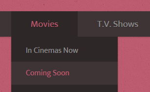
Take a look at the demo to test it out and see what the end result looks like. The below HTML and CSS dropdown menu relies on z-index for some of the functionality, which can sometimes trip up beginners. If you get stuck, don’t hesitate to ask me a question.
You might also like: Creating a Responsive Menu with HTML, CSS & jQuery
Table of Contents
1.) HTML Structure
Finished HTML
<div class="menu-wrap">
<nav class="menu">
<ul class="clearfix">
<li><a href="#">Home</a></li>
<li>
<a href="#">Movies <span class="arrow">▼</span></a>
<ul class="sub-menu">
<li><a href="#">In Cinemas Now</a></li>
<li><a href="#">Coming Soon</a></li>
<li><a href="#">On DVD/Blu-ray</a></li>
<li><a href="#">Showtimes & Tickets</a></li>
</ul>
</li>
<li><a href="#">T.V. Shows</a></li>
<li class="current-item"><a href="#">Photos</a></li>
<li><a href="#">Site Help</a></li>
</ul>
</nav>
</div>Ek Mukta Font
If you would like to use the same font as I’ve used you need a link to it in the header.
<link rel="stylesheet" type="text/css" href="http://fonts.googleapis.com/css?family=Ek+Mukta">Wrapper and Nav
We start off with a wrapper div and give it a class of menu-wrap. Inside that wrapper, we put a nav and give it a class of menu.
<div class="menu-wrap">
	<nav class="menu">
		<!-- NAV -->
	</nav>
</div>
First Unordered List
The first unordered list we’ll be using needs a class of clearfix (more on why when we write the CSS). Inside it, we’ll put a couple of links to act as menu content.
<ul class="clearfix">
<li><a href="#">Home</a></li>
<li><a href="#">Movies <span class="arrow">▼</span></a></li>
<li><a href="#">T.V. Shows</a></li>
<li class="current-item"><a href="#">Photos</a></li>
<li><a href="#">Site Help</a></li>
</ul>Nested Dropdown Menu
For the dropdown menu, we put another unordered list inside the one we already have and the HTML code is complete.
<ul class="clearfix">
<li><a href="#">Home</a></li>
<li>
<a href="#">Movies <span class="arrow">▼</span></a>
<ul class="sub-menu">
<li><a href="#">In Cinemas Now</a></li>
<li><a href="#">Coming Soon</a></li>
<li><a href="#">On DVD/Blu-ray</a></li>
<li><a href="#">Showtimes & Tickets</a></li>
</ul>
</li>
<li><a href="#">T.V. Shows</a></li>
<li class="current-item"><a href="#">Photos</a></li>
<li><a href="#">Site Help</a></li>
</ul>2.) CSS Styling
Finished CSS
body {
	background:#bf5c71 url('body-bg.jpg');
}

.clearfix:after {
	display:block;
	clear:both;
}

/*----- Menu Outline -----*/
.menu-wrap {
	width:100%;
	box-shadow:0px 1px 3px rgba(0,0,0,0.2);
	background:#3e3436;
}

.menu {
	width:1000px;
	margin:0px auto;
}

.menu li {
	margin:0px;
	list-style:none;
	font-family:'Ek Mukta';
}

.menu a {
	transition:all linear 0.15s;
	color:#919191;
}

.menu li:hover > a, .menu .current-item > a {
	text-decoration:none;
	color:#be5b70;
}

.menu .arrow {
	font-size:11px;
	line-height:0%;
}

/*----- Top Level -----*/
.menu > ul > li {
	float:left;
	display:inline-block;
	position:relative;
	font-size:19px;
}

.menu > ul > li > a {
	padding:10px 40px;
	display:inline-block;
	text-shadow:0px 1px 0px rgba(0,0,0,0.4);
}

.menu > ul > li:hover > a, .menu > ul > .current-item > a {
	background:#2e2728;
}

/*----- Bottom Level -----*/
.menu li:hover .sub-menu {
	z-index:1;
	opacity:1;
}

.sub-menu {
	width:160%;
	padding:5px 0px;
	position:absolute;
	top:100%;
	left:0px;
	z-index:-1;
	opacity:0;
	transition:opacity linear 0.15s;
	box-shadow:0px 2px 3px rgba(0,0,0,0.2);
	background:#2e2728;
}

.sub-menu li {
	display:block;
	font-size:16px;
}

.sub-menu li a {
	padding:10px 30px;
	display:block;
}

.sub-menu li a:hover, .sub-menu .current-item a {
	background:#3e3436;
}
Base Styling
We start the CSS with some base styling by setting a page background colour and setting up a clearfix. Don’t worry if you don’t have the background image it’s only a simple texture. You can grab it from the demo if needed.
The clearfix will stop an annoying bug where, if a parent element has a floated child element, it will disappear.
body {
	background:#bf5c71 url('body-bg.jpg');
}

.clearfix:after {
	display:block;
	clear:both;
}
Menu Setup
Now we need to set up the outline of the entire menu and style a few ‘global’ elements (two or more elements with the same styling).
/*----- Menu Outline -----*/
.menu-wrap {
	width:100%;
	box-shadow:0px 1px 3px rgba(0,0,0,0.2);
	background:#3e3436;
}

.menu {
	width:1000px;
	margin:0px auto;
}

.menu li {
	margin:0px;
	list-style:none;
	font-family:'Ek Mukta';
}

.menu a {
	transition:all linear 0.15s;
	color:#919191;
}

.menu li:hover > a, .menu .current-item > a {
	text-decoration:none;
	color:#be5b70;
}
Dropdown Arrow
The arrow by default is quite large so we make the font-size smaller and remove the line-height. If we leave the default line-height the menu styling may become affected.
.menu .arrow {
	font-size:11px;
	line-height:0%;
}
Top Level Menu
To style just the top-level menu we can use the > symbol. It states that only the first child element preceding the parent will get the specified styling. E.g. .parent > child, only the top-level .child will get the styling whereas any children of .child that are also called .child won’t.
We also set a position:relative; on the parent list item in case it has a child (aka a submenu).
/*----- Top Level -----*/
.menu > ul > li {
	float:left;
	display:inline-block;
	position:relative;
	font-size:19px;
}

.menu > ul > li > a {
	padding:10px 40px;
	display:inline-block;
	text-shadow:0px 1px 0px rgba(0,0,0,0.4);
}

.menu > ul > li:hover > a, .menu > ul > .current-item > a {
	background:#2e2728;
}
Bottom Level Menu
Here’s the fun part…and also the main point of this article. To style the sub menu we first need to position it. We do that with position:absolute;. By setting a percentage as the top instead of a fixed pixel value the submenu will always be positioned exactly at the bottom of its parent.
We also add z-index:-1;. This pushes the dropdown menu behind the everything else on the page, including the body element.
There’s also no opacity, this is so the submenu can fade in by using a transition.
For the transition you may want to use prefixed values if you’re targeting older browsers, however, for the purposes of this tutorial, we’ll be aiming at Firefox and Webkit based browsers (Webkit browsers include Google Chrome and Opera).
You may also wonder what the rgba(0,0,0,0.2) is. It states a colour (Red, Green and Blue) then the opacity (Alpha), in this case, it’s 20% (0.2)
/*----- Bottom Level -----*/
.sub-menu {
	width:160%;
	padding:5px 0px;
	position:absolute;
	top:100%;
	left:0px;
	z-index:-1;
	opacity:0;
	transition:opacity linear 0.15s;
	box-shadow:0px 2px 3px rgba(0,0,0,0.2);
	background:#2e2728;
}
To get the dropdown menu showing on hover we need to add a line that states when hovering over a list item, show its children. This has no effect on empty list items as they have no children to show.
.menu li:hover .sub-menu {
	z-index:1;
	opacity:1;
}
The rest is the styling of the submenu list items and anchor links.
.sub-menu li {
	display:block;
	font-size:16px;
}

.sub-menu li a {
	padding:10px 30px;
	display:block;
}

.sub-menu li a:hover, .sub-menu .current-item a {
	background:#3e3436;
}
Conclusion
Some of the CSS used may be a little hard to wrap your head around at first, especially if you’re a beginner. If you need help in any way create a JSFiddle of your code and post the link to it in the comments.
Thank you for reading and I look forward to chatting with you below!
You might also like: Creating an Accordion with HTML, CSS & jQuery
AC
June 30, 2015 at 3:48 pm
Hi thank you so much for this tutorial it has really helped me. Now that I have added titles to my navigation bar I am struggling to figure out how to link pages in those titles that correspond with the blog post. Is it possible if you can help me?
Thanks.
ted
June 26, 2015 at 8:26 pm
if you add a
position:fixed to the style of
.menu-wrap -after adding that hover under the nav bar. It makes the dropdown appear eventhough you are not directly over the “Movies” text. Hovering under the “movies” makes the nav dropdown appear and it shouldn’t. Is there a workaround?
How can I make this nav bar fixed without this weird effect.
Rob
November 4, 2015 at 7:21 am
I am experiencing the same issue. Did you manage to find a work around?
JR
June 17, 2015 at 8:46 pm
I’m trying to get this to work using a unordered List with multiple Rows. What keeps happening is the submenu pops up over the top level items even when you’re not hoovered over the correct list item with a sub menu. To test this you can use your same demo and add “width: 50%;” to the Top level .menu > ul > li
.menu > ul > li {
float:left;
display:inline-block;
position:relative;
font-size:15px; /*—-Top Level Font Size—-*/
width: 50%; /*—-Forces List into two Columns—-*/
z-index:2;
}
I’ve tried playing with z-index on Top level items with no success so far, though I’m just relative beginer with CSS.
Nate Smith
July 6, 2015 at 5:08 pm
Running into this same problem here, does anyone have any suggestions on a solution?
Raghavendra Rao PV
June 15, 2015 at 8:19 am
It would be really helpful if you could include the screenshot of the menubar
—
Regards,
RRPV
Bob
June 15, 2015 at 12:50 am
I’m replying to your Creating a Dropdown Menu with HTML & CSS article. I really like this menu vs. others I’ve tried however I’d also like another box to appear off to the side on hovering on a sub menu item & tried fiddling with that without success. Is there a way to do that with your menu? Would appreciate any pointers if possible. I’m including your code I modified for my purpose. Thx……bob
css
.clearfix:after {
display:block;
clear:both;
}
.ten { color:#ff0000 }
/*—– Menu Outline —–*/
.menu-wrap {
width:50%;margin-left:0px;
background:#none;
}
.menu {
width:900px;
margin:-8px
}
.menu li {
margin:0px;
list-style:none;background:#000000;
font-family:’arial’;font-weight:normal;text-align:left
}
.menu a {
transition:all linear 0.05s;
color:#DEB976;text-decoration:none
}
.menu li:hover > a, .menu .current-item > a {
text-decoration:none;
color:#DCDCDC;
}
/*—– Top Level —–*/
.menu > ul > li {
float:left;
display:inline-block;
position:relative;
font-size:18px;box-shadow: 0px 0px 2px 4px #1a31ff;
}
.menu > ul > li > a {
padding:5px 14px;
display:inline-block;
}
.menu > ul > li:hover > a, .menu > ul > .current-item > a {
background:#000000;
}
/*—– Bottom Level —–*/
.menu li:hover .sub-menu {
z-index:1;
opacity:1;
}
.sub-menu {
width:530%;
padding:5px 0px;
position:absolute;
top:100%;
left:0px;
z-index:-1;
opacity:0;
transition:opacity linear 0.2s;
box-shadow: 0px 0px 4px 5px #1a31ff;
background:#000000;
}
.sub-menu li {
display:block;
font-size:16px;
}
.sub-menu li a {
padding:5px 12px;
display:block;
}
.sub-menu li a:hover, .sub-menu .current-item a {
background:#0015D0;
}
html
Info
• How Bad Ass is The Boss?
• Who runs The Boss?
• Why is The Boss underground?
• Bands that’ve pitched in.
• How long has The Boss been up?
• Why can’t I listen with my player?
• The motivation behind The Boss?
• How I get the audio better than most?
Aaron Pearson
June 10, 2015 at 7:50 pm
i having trobble seting it up please help : This is what i put it is
test.html :
<body
Home
Movies ▼
In Cinemas Now
Coming Soon
On DVD/Blu-ray
Showtimes & Tickets
T.V. Shows
Photos
Site Help
and the css file:
menu.css:
body {
background:#bf5c71 url(‘body-bg.jpg’);
}
.clearfix:after {
display:block;
clear:both;
}
/*—– Menu Outline —–*/
.menu-wrap {
width:100%;
box-shadow:0px 1px 3px rgba(0,0,0,0.2);
background:#3e3436;
}
.menu {
width:1000px;
margin:0px auto;
}
.menu li {
margin:0px;
list-style:none;
font-family:’Ek Mukta’;
}
.menu a {
transition:all linear 0.15s;
color:#919191;
}
.menu li:hover > a, .menu .current-item > a {
text-decoration:none;
color:#be5b70;
}
.menu .arrow {
font-size:11px;
line-height:0%;
}
/*—– Top Level —–*/
.menu > ul > li {
float:left;
display:inline-block;
position:relative;
font-size:19px;
}
.menu > ul > li > a {
padding:10px 40px;
display:inline-block;
text-shadow:0px 1px 0px rgba(0,0,0,0.4);
}
.menu > ul > li:hover > a, .menu > ul > .current-item > a {
background:#2e2728;
}
/*—– Bottom Level —–*/
.menu li:hover .sub-menu {
z-index:1;
opacity:1;
}
.sub-menu {
width:160%;
padding:5px 0px;
position:absolute;
top:100%;
left:0px;
z-index:-1;
opacity:0;
transition:opacity linear 0.15s;
box-shadow:0px 2px 3px rgba(0,0,0,0.2);
background:#2e2728;
}
.sub-menu li {
display:block;
font-size:16px;
}
.sub-menu li a {
padding:10px 30px;
display:block;
}
.sub-menu li a:hover, .sub-menu .current-item a {
background:#3e3436;
}
mike young
June 1, 2015 at 11:34 am
Your code provide does not seem to work correctly as your demo does.
I had the same issue after going through the tutorial, if I then just copied and pasted your finished html and finished css it still has the same problems.
1) The .menu-wrap background does not seem to get applied. The whole nav bar is see through.
2) when you hover over so the sub menu appears if you move the mouse of it so it hides again the body under the nav bar goes white for a split second
http://jsfiddle.net/tkj0jvf6/t
Quan
July 3, 2015 at 11:08 pm
I’ve got the same problem. I hope you reply fast, because I’m a noob that cannot fix it by himself..
Alex
January 12, 2016 at 3:33 pm
Hi, I had the same problem as you did with the .menu-wrap background. I checked everything and it turns out ‘float: left’ from ‘.menu > ul > li ‘ of the top level menu was what caused the background of .menu-wrap to disappear.
Removing ‘float: left’ will reveal the background, but that does mean the menu buttons are seperated.
I have no idea how to fix this, honestly.
willy
May 31, 2015 at 9:15 am
is that not working at mozilla firefox??
DripGames
May 25, 2015 at 3:02 am
I’m looking around for cool CSS stuff and I found this, but one question: is there a way to stop the webpage from making a new div element with
not give the top bar the same effect? If so please help me, thanks in advance! ☺Seb Kay (Author)
May 25, 2015 at 8:28 am
Can you give me an example of what you mean?
Matthew
May 25, 2015 at 4:57 pm
What I mean is this code here makes the second div (which the navigation bar is not part of) apply the margin to the other div, in other words, the navigation bar is being controlled by the style of a different element.
DripGames A.K.A. Matthew
May 25, 2015 at 5:00 pm
Sorry I forgot the code, here it is: https://jsfiddle.net/sdLmgtyb/1/
Seb Kay (Author)
May 26, 2015 at 7:32 am
I see what you mean. Here’s a fixed version https://jsfiddle.net/sdLmgtyb/2/.
The problem is this: because the menu items are being floated, it breaks the height of the top parent element, which is
.menu-wrap. The best way to fix this is to either use a clearfix, or adddisplay:inline-block;to the element that’s breaking.hermoini
May 15, 2015 at 1:45 pm
Hi,
My menu drop down going behind text in Chrome . Even after adding z-index it doesn’t work.
Note : the same worked in IE and Mozilla
hermoini
May 15, 2015 at 1:51 pm
Below is my code
http://jsfiddle.net/86x5f8we/8/
Seb Kay (Author)
May 18, 2015 at 8:39 am
Hi Hermoini, the demo you posted seems to be working fine for me in Chrome. I see you said z-index didn’t work, but did you also add
position:relative;to the item with the z-index on it? Elements only work with z-index if they have a position of relative, absolute or fixed.hermoini
May 18, 2015 at 10:45 am
Thanks for the reply.
Yes position is added to the item using z-index. But still on hovering over my menu, the sub menu goes behind the text that is displayed below the navigation menu.
Earlier the drop down was always shown. I resolved it by display:none and adding z-index on hover only. Seems this soln not working in Chrome.
Seb Kay (Author)
May 20, 2015 at 7:45 am
You could also try adding z-index to the top most parent of the menu. Also, check if there is any z-index on the text that’s going over or it’s parent. Z-index is tricky like that 🙂
Mette
May 15, 2015 at 7:42 am
Hi,
First of all – sorry for my terriable english, I hope you can understand what I’m trying to say.
I’m working on my localhost, so thats why I don’t have a URL. (If you don’t get what I mean, I can send you a screenshot)
I’m trying to use you code, but I can’t see the long black box which is surronding all of the menu points, the box which proberly is a 100%. I’ve been trying to find the place in your css file, but it I can’t find it. Do you have any idea what I’ve done wrong or can you tell me where in the css file that part of the design should be.
Kind regards
Mette
Seb Kay (Author)
May 15, 2015 at 8:27 am
Hey Mette, to get the “long black box”, you just need to wrap your menu in a div and make it 100% width of the screen. The use
margin:0px auto;on your.menuitem to center it.Harneet
May 12, 2015 at 2:42 pm
In the above example I see a lot of places in css you have mentioned as –
li > a
why do you do that ? As I see if you even mention li even then the css takes effect . For E.g below css tags
.menu > ul > li > a {
padding:10px 40px;
display:inline-block;
text-shadow:0px 1px 0px rgba(0,0,0,0.4);
}
.menu > ul > li:hover > a {
background:#4e2728;
}
Seb Kay (Author)
May 13, 2015 at 7:52 am
Hey Harneet, great question. The reason is because when you do
li > a, it only affects the next level of child elements. However, if you have another list nested inside thatli, then withoutli > ait’ll affect all theatags, not just the first level deep.Oscar
May 7, 2015 at 1:50 pm
The dropdown section isnt supported on mobile devices is there a fix for this or not?
Greetz Oscar
sanket
May 1, 2015 at 12:48 pm
The tutorial is very helpful for me. It works fine, and explained very clearly…thanxs!!!
Mark
April 29, 2015 at 8:48 pm
The menu doesn’t show in Google Chrome, but works for other browsers. How can I make it Chrome-compatible?
anan
April 29, 2015 at 12:21 am
Hello , i liked the menu , the only problem so far i faced is , when i write text in arabic, the text appear , which means , i must be using only english in the menu .. and yes i didn’t forget to link to external
, and also tried to change in css the font type, also didn’t work ..
could you please email me ?
Thanks
[email protected]
sophie
April 24, 2015 at 1:56 pm
hey! I have a website with format.com which comes with its own template theme. I want to edit the html and CSS to create dropdown menus for each of my menus. I’ve not done much with coding before so I don’t know what i’m doing! Where do i put the finished code you created? Can i even use that? Your help would be greatly appreciated as i love the theme i have and the format website gives no help into html whatsoever.
Thanks so much,
Sophie
Mustureswara M M
April 22, 2015 at 11:09 am
thank u so much sir….. its very help full
Robin
April 22, 2015 at 9:08 am
Thanks a lot for the Menu.. however I am unable to add a 2nd or 3rd tier of the dropdown. Could you explain the step-by-step process of adding multiple tiers of submenu?
Thanks
Robin
Milind
April 21, 2015 at 8:57 am
Hi guys. The background randomly has white rectangles appear and the dropdown bars are aren’t working properly. Could you help me find out what’s wrong? Thank you so much!
Here is the code:
https://jsfiddle.net/90c5jp0y/1/
Kula
April 20, 2015 at 3:38 pm
Hi
I just want to for help, I was building this website but I have problem with the drop down menu.
I want when I click on one of the options it takes to the next link.
this is the code:
Seb Kay (Author)
April 20, 2015 at 5:36 pm
Can you post the code again? I’ll be happy to take a look. Before posting, there’s a small note above the comment form on how to post code 🙂
Kula
April 20, 2015 at 10:36 pm
I got the problem solved but thanks.
joshdoye
April 19, 2015 at 11:13 pm
thanks alot
Tek
April 11, 2015 at 4:49 am
Awesome, simple and quick set up for dropdown menus.
I am using this for mobile, so one problem I have is that the dropdown menu does not got away after clicking the link.
This can be a problem for mobile because if the dropdown covers the entire viewport, it’s not easy to navigate.
I’ve tried JS to make the .sub-menu opacity to 0, but that messes up a lot of things.
Any solutions to this?
Chibuike Bright
April 7, 2015 at 3:36 pm
I really appreciate for sharing this project with us. it really makes my day enjoyable and easy going ,as it has been long, i have been looking for such a project in order to update my Website. pls i wanted to make the second list called T.V.show a sub-menu, so that it may appear as the first list called Movies, but it only list the items i placed on it without hiding them .pls will i do.
Ryan
April 6, 2015 at 4:34 pm
Simple question:
How come when I copy/paste your code (the finished HTML + CSS) into a JSFiddle, it looks different? I don’t see the grey bar that spans the navigation bar.
Ben
April 7, 2015 at 3:31 pm
Im having the same problem. I even viewed he page’s source code and pasted that and still get underlined links and no background
Ben
April 7, 2015 at 3:45 pm
Oh, derp… Read the author’s reply to Oscar. Go to the JSFiddle and add his fix to your own fiddle:
.menu-wrap ul {
margin: 0px;
padding: 0px;
}
.menu-wrap {
display: inline-block;
}
Anna
April 2, 2015 at 8:24 pm
Will this technique work on devices that can’t hover, like phones or tablets? If not, what do you recommend? Thank you!
Seb Kay (Author)
April 3, 2015 at 6:34 am
The majority of modern touch devices will automatically detect that it needs to dropdown. If you want to be 100% sure across every touch device, I recommend using Modernizr to detect te device type for touch functionality 🙂
Anna
April 3, 2015 at 6:08 pm
I’m not familiar with that, but will check it out – thanks! I had built a menu similar to this on my website, and it did not work on my phone. The dropdown did not stay visible long enough to click on something. I have tweaked it and made it work, but I just wondered if you had encountered this. Thanks so much for the tutorial and the reply!
Oscar
April 1, 2015 at 9:26 pm
Hello,
my menu background is a little bit messed up in shows a ugly space at the top does anyone know how to fix this?
http://prntscr.com/6oc2gt
http://jsfiddle.net/6t4q14pa/
Thanks
– Oscar
Seb Kay (Author)
April 2, 2015 at 6:36 am
Hey Oscar,
The problem was the browser adding default margin and padding. Here’s a fix: http://jsfiddle.net/6t4q14pa/1/
Oscar
April 2, 2015 at 6:58 pm
Thanks you very much!
Daniel
March 31, 2015 at 3:05 am
Hello Seb.
i tried your tutorial correctly
But when i test it, it’s not showing, Only works on JSFiddle http://jsfiddle.net/enderanims/h9w9c524/
The navbar is backgrounded and my entire site is foregrounded but not the navbar.
Thanks.
-Daniel
Seb Kay (Author)
April 2, 2015 at 6:06 am
The navbar relies on z-index, so that’s likely the cause of the problem. Have a look at your site and find out if the z-index for the nav is lower than that for the background.
Dave
March 30, 2015 at 5:22 pm
Hi, Seb.
Thanks for posting this. I’m interested in adding a second (and maybe third) tier of dropdowns. Is that easily done with this code?
Dave
Daniel
April 1, 2015 at 12:56 pm
Yes, But it’s hard to do.
Seb Kay (Author)
April 2, 2015 at 6:04 am
Thanks for helping out Daniel. I edited your code because the formatting got a little messed up somewhere along the way 🙂
Sumanta Sahu
March 26, 2015 at 7:20 am
when I save the html code in notepade the output is different.
Plz give me suggestion how to see exactly same as demo.
Daniel
March 30, 2015 at 11:41 pm
Notepad is unsupported to code
You need
Sublime text
or
Notepad++
or
Adobe Dreamweaver
or any other HTML editing programs.
Gentry Sleets
March 23, 2015 at 3:37 am
Works like a charm! Thank you! Now I can tweak from here.
Jazmin
March 21, 2015 at 5:51 am
I Put in the links. but when I actually view my blog you can see the links how do i stop the links from actually being visible on my blog.
Seb Kay (Author)
March 23, 2015 at 9:10 am
It’s likely a problem with z-index. If you post your code on JSFiddle I’m more than happy to take a look.
Eric Dryer
March 20, 2015 at 11:30 pm
I have a space before and after the menu. How do I get rid of the spaces?
Seb Kay (Author)
March 23, 2015 at 9:09 am
It’s likely a CSS problem. Can you check all elements using web inspector (both Firefox and Chrome have it) to see which ones are adding extra margin or padding? Alternatively, just post you code over on JSFiddle.
Michael
March 20, 2015 at 6:05 am
I am remodeling my website and was looking to do something similar to this. I checked out your code and it works brilliantly. Thank you for sharing! I like when the code is easy to read and it works as intended
Seb Kay (Author)
March 20, 2015 at 8:59 am
No problem Michael, I’m glad I could help. Have a great day!
CodyCoder
March 19, 2015 at 9:40 pm
How do you make the drop down menu appear on top of anything below it IE a carousel or image slider?
Seb Kay (Author)
March 19, 2015 at 9:53 pm
You need to make it
position:relative;and give itz-index:9999;. Then do the same for the image slider, but make sure the z-index is lower than that of the menu, for examplez-index:500;.Shahid
March 18, 2015 at 10:15 am
Sir how to add another two option at the right of In Cinamas Now with Yes or No option.
Plz tell me sir……….
Seb Kay (Author)
March 18, 2015 at 2:38 pm
The easiest way to do this is to add another submenu list inside the first submenu list. Then add a secondary class like
class="sub-menu depth-2"and change the positioning by overriding thesub-menuclass with those from the newdepth-2class.Hope that helps!
newbie
March 15, 2015 at 7:36 am
sir how to put the line in menu? like in your code?
Seb Kay (Author)
March 16, 2015 at 11:07 am
What do you mean by the “line”? I assume you’re referring to the menu background that spans the length of the page.
Daniel
March 30, 2015 at 11:44 pm
it’s something like this one [img]http://puu.sh/gVOhi/8fa631afc9.png[/img]
Tyler
March 11, 2015 at 8:25 pm
Is there a way to center the navigation bar on the web page?
Seb Kay (Author)
March 12, 2015 at 9:50 am
Yeah this is. The best thing to do is create a wrapper div and give it these two CSS values
display:inline-block;andmargin:0px auto;.Anonymous
March 10, 2015 at 12:59 pm
What is the font that is used. I’m not talking about the one in the code, i am talking about the one used to explain it on this site.
Seb Kay (Author)
March 10, 2015 at 4:03 pm
The one on this site is called Gudea and the one in the tutorial is called Ek Muktar. Both are available via Google Web Fonts.
sukesh
March 4, 2015 at 7:17 am
Nice.. Thank u.. it works well
Brandon
February 28, 2015 at 6:14 am
Hi,
Great tutorial, but I faced a little problem here. –
It won’t show the background color, tried many time and result is still the same, please help.
Thanks
Steve
February 28, 2015 at 12:52 am
Not sure what happened to my code here but once i added the float: left i lost the background to menu
https://jsfiddle.net/sgerace23/9up4qccf/
Other than that this has been a great article and has helped me learn more about css functions.
Steve
February 28, 2015 at 1:01 am
Never mind I was able to fix it by adding content: ‘ ‘;
aksel
February 23, 2015 at 10:20 pm
Thank you for great tutorial. Helped me a lot.
azazel
February 18, 2015 at 8:05 pm
Great job man! thanks for share!
MelissaPilegaard
February 16, 2015 at 5:53 pm
Hi
Thanks for the dropdown menu tutorial, it was a great help and well done.
I’m having some problem with the pop down menu when i wan’t to make more then one op the topics pop down. Insted of creating to difference lists, it just makes one long list that is poping down from two places.
Can you tell me how to solve this problem?
James Brower
February 15, 2015 at 7:32 pm
Hey creator, had a question of something that keeps appearing while using your code…a white bar appears when I use the dropdown menus. Do you know what could be causing this?
Krishna
February 12, 2015 at 2:22 pm
Also a quick question, this ‘Leave a Comment’ section, is this part of a plugin or did you could it yourself?
If so, any tutorials on this? Cheers
Seb Kay (Author)
February 12, 2015 at 2:25 pm
Hey Krisha,
I created this comments area myself and very recently (in the last month). If you’d like I can have a look at putting together a tutorial on replicating what you see here. Would you be interested in such a tutorial?
Krishna
February 14, 2015 at 6:19 am
That would be awesome!
Krishna
February 12, 2015 at 2:21 pm
Thanks so much mate!
I was looking for a CSS dropdown menu tutorial that would explain each section step by step, your tutorial is the first to have done this amazingly well.
Thanks again!
William
January 24, 2015 at 9:17 pm
Thank you for the post.
Only I have one problem ( I also see this on Nicholas his project):
When I point my mouse somewhere beneath the drop down list it is already showing the whole drop down list.
How to fix this?
Regards,
William
Seb Kay (Author)
January 25, 2015 at 8:14 am
Can you paste you code to JSFiddle for me to take a look at as this shouldn’t be happening (and isn’t in the demo), thanks.
William
January 25, 2015 at 11:18 am
http://jsfiddle.net/86x5f8we/
When I copy your code of the demo (demo.css) it is also doing this.
Seb Kay (Author)
January 27, 2015 at 8:56 am
Here is the updated code: http://jsfiddle.net/86x5f8we/1/
I’ve removed the opacity and z-index and replaced with display:none; and display:block;
It’s working in the JSFiddle above, let me know how you get on! 🙂
William
February 1, 2015 at 5:29 pm
Thank you, it works!
Nicholas Jackson
December 27, 2014 at 3:46 am
Thanks for writing this post, it was super helpful.
Here’s a link to my current project: http://jsfiddle.net/2vnhk0ap/
My problem is that I would like the entire menu to be centered in the page, which it currently is not. Also, I’d like to have the entire header have a solid gray background, if that’s possible.
Any suggestions on how to do so would be greatly appreciated! Thanks again!
CJ Peradilla
April 9, 2015 at 3:07 am
Hi, I’m having a hard time doing this project. I am trying to make my already-existing menu into a dropdown and can’t seem to find any other way of doing this.
I’m using a responsive bootstrap theme and this is the only line of code I have of the menu.
Many thanks,
CJ