The Way Flat Design Can Ruin UX
- 3 min read
Whether it’s flat or has 1 million gradients, the design is only a part of the puzzle. There are other concerns that in most cases need to be addressed first, like the UX (user experience). I’ve seen a trend about over the last few months and it’s worrying me, flat design is starting to take away from user experience.
UX should be at the forefront of every single thing you design and code. It doesn’t matter if it’s an app or a simple website. UX should and always will be the way you make your product succeed. Because that’s exactly what you’re making, a product.
I’m sure you’re probably thinking to yourself:
But wait, my website isn’t a product…that’s what my product is for?!
Well you’d be right and wrong. A product, in reality, is something you create and sell for others to use. Now when you have a client, they pay you for a website, you give them the product (which happens to be a website).
You work as front-end designer at a company, you’re continually working on the website, you’re creating a product, a product that leads customers to other products.
It may sound strange, but that really is what you’re doing.

Why Flat Design Isn’t Always The Best Solution
If you’ve gotten this far into the article it’s safe to say that on some level, whether you realise it or not, you probably agree with at least a little of what I’m saying. Please keep in mind that this article is about the way flat design can ruin the UX. I didn’t write that it does ruin UX because it doesn’t in most cases. I very much like and have embraced this style, as I’m sure you’ll see by the look of this site. However using it on every single thing you create is going against what you’re trying to achieve.
As designers we like to create things that look good and work in the best, most usable ways possible. Using flat design on every single project goes against that because you’re no longer creating, your just copying what you’ve already done. Sometimes re-using things you’ve done before is useful, doing it all the time defeats the point of saying your designing to begin with.
How It Can Affect Usability
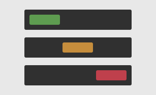
The one thing, if anything, you should keep in mind when using the ‘flat’ style is that it’s not always obvious what things are. Take the below image for example, it’s much easier to see what’s a clickable button and what’s a highlight on the right:

“So What’s The Solution?” I Hear You Ask
The truth? There isn’t one. There’s no one size fits all answer as to which option is best. The example I used above just showcased what was the best solution in that situation. When you get into mobile design the situation is completely different since on mobile the interface has to be simplified to be usable, so in most cases flat design is the best solution.
I once read a part of The Smashing Book #2 by Christoph Kolb, the section was called “Applying Game Design Principals to User Experience Design”. It’s a great read if you haven’t already gotten around to it. It basically describes how you can take simple game mechanics and apply them to your website or app designs. It describes things like maximizing the user-company relationship, and shows you how to look at your company and the user as two players in a game, a game of cooperation and/or competition.
The reason I mention it is because it’s one of the best examples of someone explaining just how important the users are. Neglecting your users is the same as just shutting down your company or website, because if you neglect them, that’s what will happen.
Conclusion
The thing to keep in mind every time you find yourself asking: Flat, non-flat or both? Just think this: The one that works!
That’s really the best way to face it. Design is subjective, meaning that it looks a certain way to certain people. Someone may have created an application that they see as the best thing since sliced bread, someone else may just see a page with a confusing UI and all around bad experience.
Never forget that design is subjective. I class that as the golden rule.