Taking a Look at CSS-Tricks v11
- 3 min read
Reasoning Behind The Critique
I’ve been listening to the ShopTalk Show podcast a lot lately. Something I haven’t done for a while and I’m thoroughly enjoying it. Great job on the show Chris and Dave. I’m looking to expand on my Inspirational Pixels content and what better way than to critique another (very popular) web development blog, CSS-Tricks.
Chris has does an amazing job of giving back to the community that made him such a success in the web design industry. So as a member of this community I want to give my two cents.
Overall Layout and Design
When I look at a site I try to see past just the visuals. Getting stuck in the ‘pixel perfection’ mindset is a bad place to be, trust me I’ve been there.
General Typography
I prefered the last typeface Chris used for the body copy as this one doesn’t render very well on Windows (then again not may fonts do).
Headings all seem good sizes and everything is clearly readable.
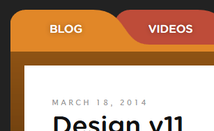
On the single post pages the post titles are displayed in a featured area of sorts. It’s a nice touch but the font colour of the smaller text could use some work since the grey is hard to read on the orange background.
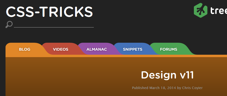
The Header
The first thing that strikes me is the simplification of what was previously a much busier design. The header is nice and clean and gives a very modern spacious feel. The advertisement for Treehouse seems very trustworthy because it looks as if a lot of attention has gone into its placement and appeal.
The search box stands out enough for me to be able to find, but not so much that it’s the first thing I see, which is a good thing. Unfortunately I’m not a fan of there being no submit button for the search area. Luckily Chris’ site is focused solely at those of us making and breaking websites all day long, so we know how to use it. However I do think that having a search button is an added step of helping the user to their end goal.
Hint: There’s a neat little trick when you hover over the logo.
Navigating Around
The colour coding on the navigation is a great touch and helps differentiate areas of the site. It may look nicer if the currently active nav item blended with the content area below instead of a sudden colour change from orange to dark orange. Also the gradient effect on the content background seems too much. As if the orange is blending with the black to quickly.
The separation of categories from the lodge is a nice touch.
Post Snippets
By post snippets I mean the snippets from each post on the homepage.
The difference between normal posts and link posts is good. It’s clear which is which.
The paper fold effect is a nice touch aswell, albeit a little buggy, but I know Chris is working on fixing that.
I’m not such a fan of the way the advertisements look the same as the post snippets. On the homepage it’s not such a big deal but at the bottom of posts it’s not obvious at first, as it should be.
Sidebar Modules
The site has changed from the three column layout it had last time around to only two this time. I feel it’s a good decision. The old site was quite busy on the homepage and although it was intended to be a hub of sorts, it didn’t really give users what the site is mainly focused on, that being articles and tutorials on web development.
It’s good to see the Treehouse again in the sidebar but with more information than it has up top. It seems to validate the top advertisement with more info making it seem even more trustworthy.
Social Links
Good idea with social links. Considering how many there are it must have been difficult to create a concept that worked. It gave me inspiration for my own site. However I only added five social links to the header.
Final Words
First I’d like to say great job Chris. I much prefer this design over the last one since it feels more well-rounded. It also feels more clear as to where I can go and what I can do.
There are a few things I’d like to change (mentioned above) but overall I really like it. I’ve always enjoyed Chris’ unique design style. It’s very unlike any other I’ve seen but still great to look at and analyze.
Keep up the good work Chris, would like to hear your thoughts on my thoughts…if that makes sense. Looking forward to new articles and content!