A Fresh Design Update for Inspirational Pixels!
- 6 min read
Over the last few weeks, I’ve been hard at work designing the new look Inspirational Pixels. In this article, I want to go over a few things about the design, discuss why I made certain decisions and so on.
Leave me a comment below with your thoughts on the new design. I’m always looking for constructive feedback on how best to improve this site to make learning and absorbing content easier.
Since the new design has a few new pieces of functionality, I thought it best to require a quick video showing you the highlights of the new design.
I’ll be recording more videos over the next few weeks that cover things like coding and workflow. The above video was used as a test and a walkthrough. That way I’ll be ready to get back on the video train come next week. It’s been a while since I recorded a screencast, so bear with me while I get my bearings!
If you’ve got any suggestions on what to record next, simply leave me a comment below and I’ll do my best to set it up for you.
A Fresh Look
The old design was ok, but the bulk of it was done sometime last year when I didn’t really have a lot of time and getting the site updated was time-consuming.
I’ve actually made a few tweaks to old the design since launching it, for example, 3D buttons and better-styled form fields. Other than that though there was a big problem I had to address with this update, the old design wasn’t very scalable.
There are some big plans in the pipeline for Inspirational Pixels in the near future and having a design that could accommodate that was 50% of the reason this new design exists.
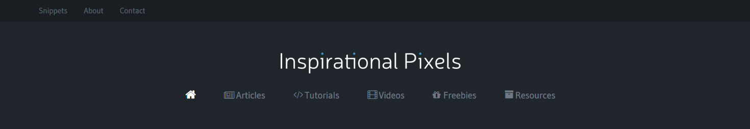
You may notice that the overall site structure has stayed the same, and for the most part it has. When I planned out the design I wanted to keep a lot of what was here, but simply update it to look and, more importantly, work better.
To achieve this updated look I created a new Git repository, copied the old theme over and started making the changes. The main reason for this is I want all future theme updates to be done in one repository, and so far I’ve gone through 7, 8 including this latest version.
A few weeks ago I actually updated the theme on this site to v8, however, as the old theme was the starting point for this new one, nothing changed visually when it was updated. It was simply a case of creating a Git branch and making the design changes from there.
Although the new site has quite a few new bits and pieces, the core of the site is the same. Something which I’m pretty happy with.
Rather ironically, Nathan Barry posted an article just after I’d already finished the code for this design update. His post is about why you should realign and it’s a pretty good read and highly recommended for anyone considering a redesign (hint: realign, don’t redesign).
New Snippets Section
I’ve been working on the snippets section of this site since sometime last year, but like I said above, the old design wasn’t very good for scaling. Essentially, the more I tried to add, the more the visuals of the site felt broken.
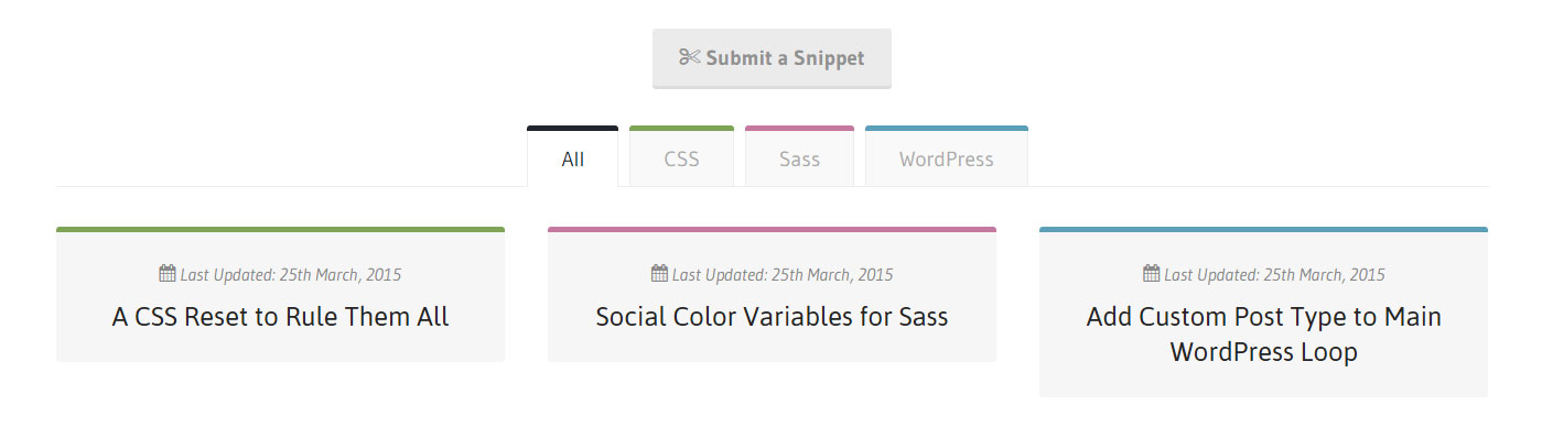
I encourage you to go take a look at the snippets section and even submit a snippet if you’ve got some code handy!
Search Filters
So far there are three main types of content on the site, posts, freebies and code snippets. To make searching for what you’re after easier, I decided early on in the design process to create some filters for search.
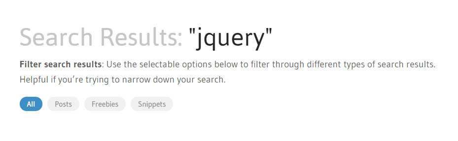
When you make a search, the default behavior is to show all content, you can then filter it by either posts, freebies or snippets. At a later date I plan on making this work with Ajax, so the functionality is a little more streamlined. However for now, it works just as good as I expected and was actually a lot easier to code than I anticipated.
Code in Comments Has Finally Arrived!
For the longest time I’ve wanted to have the ability for readers to post code snippets in comments. Up until now you’ve had to link to a JSFiddle, but no longer! I managed to make the code in comments work so you can now post anything you’re having problems with below.
Why hasn’t this happened before? That’s a very valid question and seems like something a web design and development blog should have by default. Here’s the reason: JS and CSS were being outputted fine, but for some reason HTML was getting the ol’ HTML entities treatment.
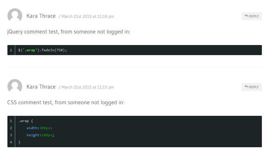
I managed to find a way around it so you can now post code in your comments and I can help you out directly from the tutorial page you’re on!
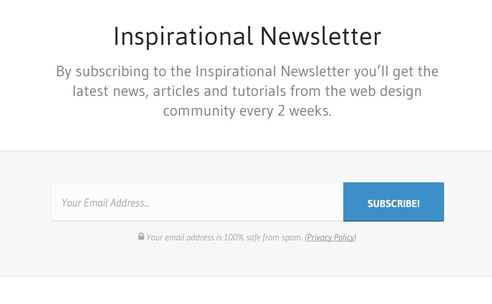
Streamlined Landing Pages
On the site I have a few landing pages for collecting email addresses. So far those include the Inspirational Newsletter and the 5 days to more conversions email course (with a few more that I’m keeping secret for now).
The problem with the old landing pages was that they were hard-coded. Meaning every time I wanted to tweak some copy or images, I had to edit the theme directly. I’ll admit, it wasn’t the smartest workflow I’ve ever set up.
The combat this problem, I enlisted the help of a trusty plugin I’ve been using on client projects for a while, Advanced Custom Fields.
By using the plugin I could add special fields that only show up when a page is using the special landing page template I created. This has been a huge time saver and made editing the landing pages 10x easier.
Other Smaller Fixes
- Video play time: The play time of each video now been added to the article meta info (with a nice little play icon to make it obvious what the time is for).
- Lighter sidebar design: All that dark was a serious distraction from the content. It’s now been replaced with a lighter, more relaxed design.
- Improved typography: I made a load of tweaks to the way type is displayed in articles and across the site. Reading is now easier than ever.
- FAQ section on landing pages: All landing pages now have a FAQ section, so subscribing for things is more transparent.
Conclusion and Thank You!
I’ve really enjoyed working on this latest design, especially since it’s actually the precursor to some bigger changes and updates coming nearer the summer.
Thanks to everyone who’s made this site what it is today. I write tutorials and articles to help other web designers and developer get better at what they do. Every time someone posts a nice comment and/or I help them in some way, it validates exactly I’m trying to do here.
Keep an eye out for some pretty awesome changes, features and updates coming to Inspirational Pixels in the next few months!
John
April 20, 2015 at 5:29 pm
I love this blog style.
What framework did you use?
Is there template that looks like this blog?
Seb Kay (Author)
April 20, 2015 at 5:37 pm
I coded this site from scratch using my own custom framework, called Bebel. There isn’t a template, however I may release a version for download in the future. Also thanks for the kind comment, really appreciate it!
John
April 1, 2015 at 7:39 pm
I love getting your newsletter and appreciate the tech tips you provide. I have a project in mind and not really sure where to start. I want to create an animation effect, for example, an flash illustration of a dancing couple with a slight drop shadow around their feet. The effect would appear on one side from the screen, moves across my web page, overlapping all content then disappears at the opposite edge of the screen. Any suggestions on how best to get started.
Seb Kay (Author)
April 2, 2015 at 6:17 am
Thanks John, I’m really happy to hear you’re enjoying the newsletter. There wasn’t one this week because of the new design launch, but it’ll be going out next week instead.
To get the effect you’re after, I would recommend CSS animations and SVG. There’s quite a lot involved in doing something like this, so it’ll take a while to learn, but here are a few resources to help you get started:
Hope this helps 🙂